10 Tips for Making Beautiful Charts
June 18, 2021
Originally published on Economics from the Top Down
Blair Fix
They say that a picture is worth a thousand words. In science, the corollary is that a good chart is worth a whole article.
Okay, that’s probably an exaggeration … but only slightly. Millions of words are spilled each day communicating science. Yet people have finite time to read. The consequence is that most people skim articles, looking for things that interest them. What’s going to catch their eye as they skim? In a word, charts.
I speak from personal experience. When I discover an interesting-looking article, the first thing I do is look at the charts. If they’re intriguing, I read the article in more detail. I suspect that many scientists (and general readers) do the same. So I don’t think it’s an exaggeration to say that the best way to improve your scientific communication is to learn how to make charts that pop.
Software
The ten chart-making tips below are about aesthetics, so they’re software agnostic. That being said, choosing the right software makes the job easier. I use the R ggplot package for all of my charts. (R users: I’ve included footnotes with ggplot coding tips. Also, see this post for a brief ggplot tutorial.)
Although I use R, you can likely achieve the same results using any scripting language. If you’re a spreadsheet user, however, be aware that this software is limiting. It may be possible to use Excel to implement the tips described below. But it would probably be painful. Spreadsheet software is just not designed for complex graphics.
Scripting languages, on the other hand, allow fine-grain control over your charts. They also make it easier for you (and others) to keep track of what you’ve done. That’s an important part of doing open science. Scripting languages also make it easy to reuse the same chart design. That way you only have to do the time-consuming design work once.
Alright, enough about software. On to the 10 aesthetic tips for making great charts.
1. Make your charts big
Here’s one of my pet peeves: small charts. It annoys me when scientists make nice-looking charts, but format them to be inexplicably small.
Now, I understand the motivation for small charts. In the past, articles were designed to be printed. That made space a scarce commodity. So it made sense to make charts that were relatively small. But today, the vast majority of reading is done online, where space is unlimited. So there is no reason to make the reader strain their eye. Charts can (and should) be big.
Compare the two charts below. One is cartoonishly small. The other is large. Which one do you prefer?

If you’re writing online, most hosting sites (like WordPress, Medium or Substack) have a good default image size. Use these defaults.
If you’re creating a pdf, a good rule of thumb is to size your chart so that it’s roughly the same width as the text. Often, this means that the chart (and accompanying description) will take up a whole page. That’s okay. Remember, in the digital universe you have unlimited space. So don’t sell yourself short by making a great chart and then sizing it too small. Make your charts big.
2. Pay attention to plot dimensions
The corollary of plot size is plot dimension. Should the chart be square? Tall and thin? Short and wide? The answer depends on what you’re trying to emphasize.
A chart that is short and wide emphasizes the horizontal axis. The chart below, for instance, shows the rise and fall of the British Empire, as measured by relative energy use. Because the chart is short and wide, it emphasizes the passage of time on the x-axis.

Now let’s look at the same chart, but this time make the vertical axis taller. Although the data is identical, this taller chart (below) feels different. Why? Because it emphasizes the y-axis. Rather than highlight the passage of time, the taller chart highlights the rise and fall of relative energy use.
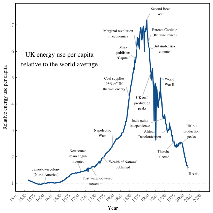
The choice of chart dimensions depends on what you’re trying to emphasize. But as a rule, I prefer charts that are nearly square. In contrast, many scientists make charts that are short and wide, perhaps because that’s the default shape in Excel. The problem with this shape is that it tends to de-emphasize the y-axis. Yet it’s usually the y-axis that we want the reader to focus on. So don’t sell your y-axis short. Make tall charts!
3. Use color to show a 3rd dimension
The coordinate plane is the most basic element of plotting. This plane is great for visualizing 2 variables. But how do you visualize 3 or more variables?
One possibility is to make a 3D chart. You project a 3rd dimension onto the 2D page.1 The problem with this approach, though, is that the reader is still looking at a 2D surface. That can make the 3rd dimension difficult to interpret.
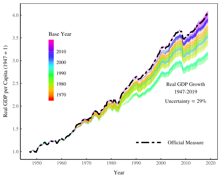
A better approach is to use color to show a 3rd dimension. This allows you to display 3 variables while retaining the clarity of a 2D plot. The chart below, for instance, shows the growth of US GDP per capita over time. I’ve put time on the x-axis and indexed growth on the y-axis. I’ve used color to show a 3rd dimension — the ‘base year’ used to estimate the growth of GDP.2
Besides color, another possibility is to use varying point size to show an extra dimension. The Gapminder app does this to great effect. It plots countries as circles, with circle size indicating population. Study this software. It’s one of the best examples of scientific visualization.
4. Show regression confidence intervals
Scientific charts usually do two things:
- Show the raw data
- Show the trend in the data
Most often, you’ll plot the raw data using a scatter plot. Then you’ll draw a line through it to show the trend. In statistical jargon, we call this trend a ‘regression’. In addition to plotting the trend line, I like to plot the regression ‘confidence interval’. (If you’re wondering what this is, I’ll explain in a bit.)
The chart shows how average firm size grows with energy use per capita. I’ve plotted the best-fit line for the regression. I’ve also plotted the regression confidence interval, shown as the gray region around the line.3
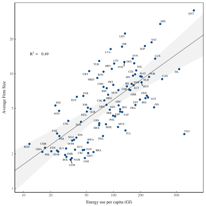
What is a ‘regression confidence interval’? It’s the uncertainty in your best-fit line caused by the limited size of your sample of data. The smaller the data sample, the larger the regression uncertainty (and vice versa). The regression confidence interval shows the probable range for your line of best fit.
I like to show the regression confidence interval for two reasons. First, it looks cool. It adds curves to an otherwise straight line. Second, the regression confidence interval visualizes important information. It tells the reader how much uncertainty there is in the data trend. Of course, this information could be summarized in a table. But my rule of thumb is this: if there’s a simple way to visualize data, do it. Plot your regression confidence intervals!
5. Pay attention to point size
The scatter plot is the most important tool in your chart-making repertoire. It’s the best way to visualize correlation.
A simple way to improve your scatter plots is to pay attention to the size of your data points. The size should be inversely proportional to the number of observations. In a chart with a few dozen observations (like the one below), the point size should be relatively large.
As you add more data to a chart, you should shrink the point size. Doing so keeps the trend visible, allowing the reader to distinguish the forest from the trees. Consider the chart below, which contains roughly 50,000 observations. To clearly show the trend, I’ve shrunk the point size to a bare minimum. This way the sparse data on the outer edges of the scatter plot doesn’t distract from the trend in the middle. So here’s my rule of thumb: the more data, the smaller the point size.

6. To show the forest (not the trees), use transparency
Whenever you’re making a chart, think about what you want to emphasize. In the chart below, I wanted to emphasize the price change between different commodities. But I also wanted to clearly show each commodity.
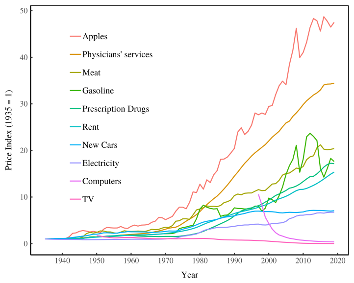
As you plot more data, the emphasis should change. You become less concerned with individual data points, and more concerned with the overall trend. A good way to emphasize this trend is to use transparency.4
The chart below shows the price change of every commodity on the US Consumer Price Index. The goal here is not to emphasize any single commodity, but rather to show the trend. To emphasize the trend, I’ve made each price series fairly transparent. This makes the chart look gray where the data is thin, and black where the data is dense. Without transparency, these details would be lost.

When you’re making a chart, see how much data you have. If there are over 10,000 data points, transparency is your friend.
7. Label significant data points
A good way to make your chart more informative is to add labels to the data. The caveat is that your labels need to be significant. Nobody wants to read a scatter plot where each data point is labeled ‘observation 1’, ‘observation 2’, and so on. But if information about the data points is interesting, put it in the chart.5
Countries names are a good example. I’ve found that whenever I plot data about countries, people want to know which country is which. You can satisfy this curiosity by labeling your data. Below, for instance, I’ve labeled countries of the world that have (or once had) a communist government. (I’ve also used color to distinguish between the two types of regimes.) Notice that I didn’t label all the countries in the chart. Doing so would have been cluttered. And when it comes to making pretty charts, clutter is your enemy.

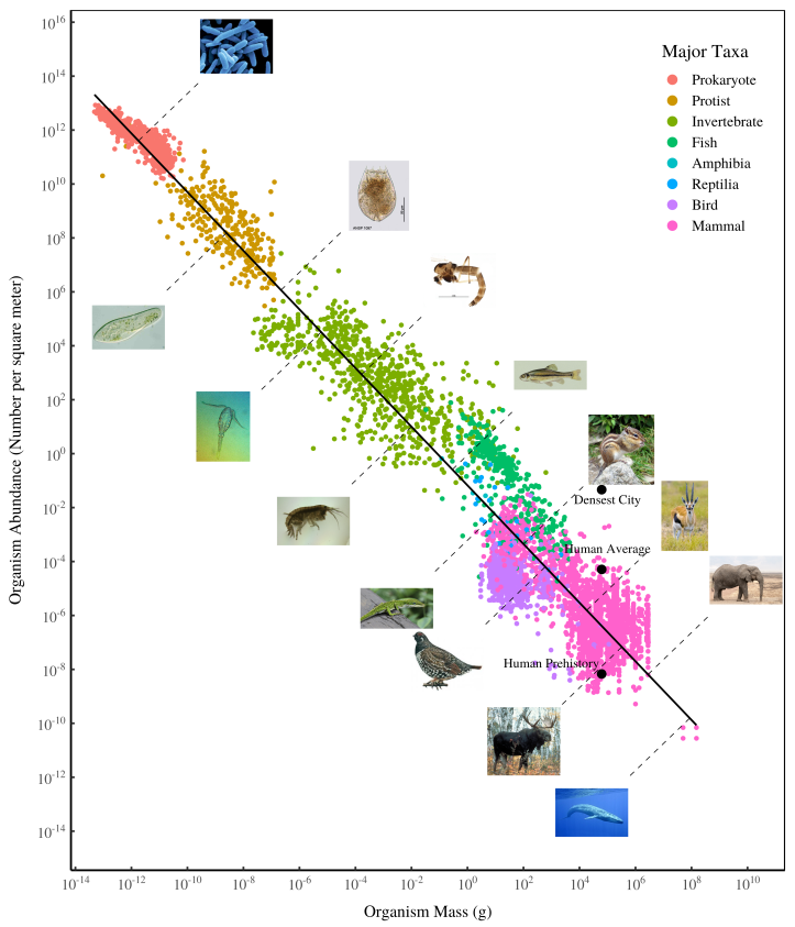
Labels need not be text. Below, for instance, I’ve used pictures to show where different organisms sit on the ‘biomass spectrum’.6 Be creative with your labels. If you can add extra information to your chart (without creating clutter) do it!
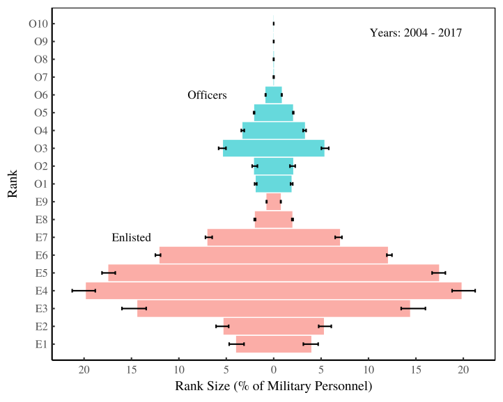
8. Rank categorical data
Unlike numerical data, categorical data has no inherent order. But as a rule, you should give it one. Rank your categorical data.
My preference is to rank categorical data by the effect you’re plotting on the opposite axis. Below, for instance, I’ve plotted various human traits on the y-axis. I’ve then ranked them in descending order of their effect on income. The resulting chart is easier to interpret (and visually more pleasing) than if I’d ranked the traits alphabetically. As a rule, plot the data so that there’s a visible trend. Patterns, not randomness, are what catch they eye.

9. Use inset plots
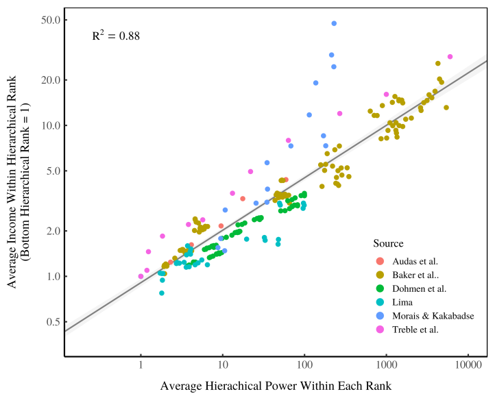
Sometimes you want to plot two sets of data that are related, but conceptually distinct. A good way to do this is to use inset plots — especially if you want to emphasize one set of data over another.7
Consider the chart below. Here I visualize estimates for how hierarchical power becomes more concentrated as energy use increases. The main panel measures this concentration using the Gini index. I’ve put most of the details in this main panel (country labels, different colors) because it’s here that I want the reader to focus. But I also want to show another way of measuring the concentration of hierarchical power (’global reaching centrality). I’ve put this extra information in an inset plot.

As a rule, inset plots should be simpler than the main plot. The inset chart above, for instance, contains no labels and uses only one color. This simplicity keeps the focus on the main plot. Also make sure to put the inset panel where your main-chart data isn’t. Sometimes this requires playing around with scales and axis dimensions. And make sure you reduce the font size on the inset panel.
Use inset panels with caution. If adding one makes your chart feel cluttered, don’t do it. Instead, display the extra information in a separate chart.
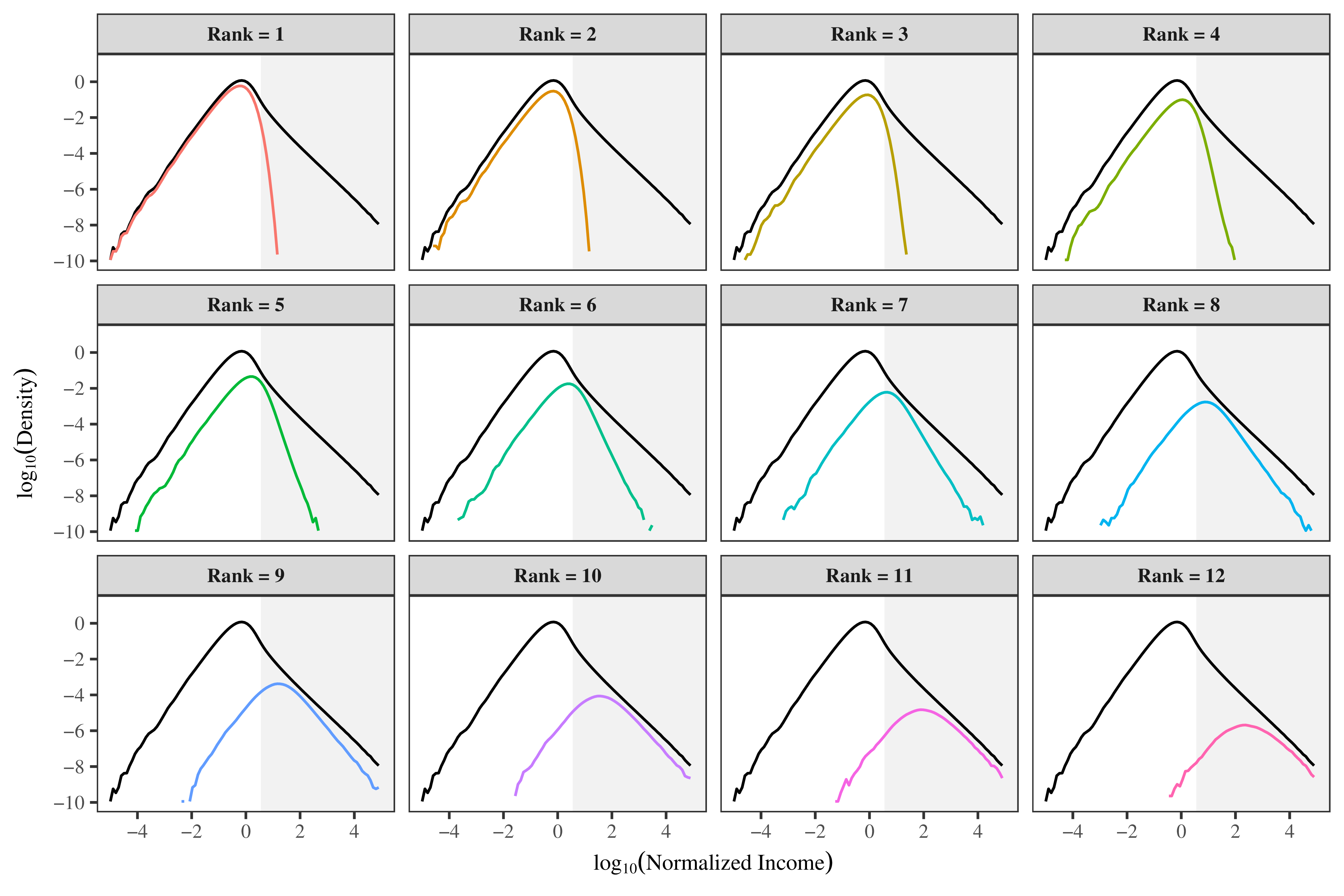
10. Use panels to show related information
Sometimes you have more data than can reasonably fit in a single plot. To avoid clutter, you can plot this type of data using panels.8
Below, for instance, is a plot of how income distribution (in a model) relates to hierarchical rank. Each panel shows both the income distribution of a given rank, and the income distribution of all ranks. The chart is visually pleasing because it uses repetition to highlight change. Each consecutive panel is similar, but slightly different.

This method works best when all of the panels share the same scale. That way you don’t have to repeat axis labels.
You can also use panels when you have a number of charts that are conceptually related. Grouping charts is particularly useful when creating a pdf. In a web document, you can have many figures interspersed with a few lines of explanatory text. But in a pdf, text tends to get separated from figures. This means readers may have to scan several pages to understand that two charts are related. Grouping charts together in panels solves this problem.
The caveat is that using panels shrinks the size of your charts. So you need to think about the trade offs. Is it better to have small charts that are grouped together? Or do you want large charts that are dispersed? Experiment with both approaches to see which works best.
Great charts take time
Good writing rarely happens on the first draft. Likewise, good data visualization rarely happens the first time you plot your data. I often revise a chart dozens of times before I’m satisfied. Sometimes I spend as much time making the graphics for a paper as I do writing the text.
To improve your chart-making skills, pay attention to the charts that you find compelling. (Browse Data is Beautiful for good examples.) What aesthetics make the chart pleasing? Try to replicate these aesthetics in your own work. Don’t worry if it takes a long time. It should. Good visualization, as with good writing, takes practice. So be patient and enjoy the process. Happy plotting!
Notes
-
If you’re dead set on making a 3D chart (sometimes there is no alternative), I’ve created an R function for projecting 3D data onto a 2D surface. Check it out at github. It’s useful for two reasons. First, unlike many 3D plotting apps, this function creates true perspective (not parallel or oblique perspective). Second, the function allows you to make 3D plots with your favorite 2D plotting software like ggplot.↩
-
Making charts with color is easy in ggplot. First, format your data so that the x, y, and color data are each in their own column. Then tell ggplot to plot three aesthetics:
x,y, andcol. In my GDP example,yeargoes on the x-axis,gdpgoes on the y-axis, andbase_yeargets displayed as color.aes(x = year, y = gdp, col = base_year)See the R Cookbook for more details.↩
-
ggplot provides a simple way to plot a regression with confidence intervals. Just use the command
stat_smooth(method = lm). Try this code that uses the preset databasecars:p = ggplot(cars, aes(speed, dist)) + geom_point() + stat_smooth(method = lm)See this article for more details.↩
-
In ggplot, you can create transparency by using the
alphacommand.alpha = 1is completely opaque.alpha = 0is completely transparent. Play around to see what looks best on your specific chart. If you want the transparency the same for all points, remember to keep thealphacommand outside theaes()call. Here’s an example:p = ggplot(cars, aes(speed, dist)) + geom_point(alpha = 0.1) -
In ggplot, the best way to label data is to use the ggrepel package. It will automatically add labels in a way that doesn’t overlap with the data points (that’s the ‘repel’ part of the name).↩
-
Here’s how you add a picture to a ggplot chart. First, read the picture into R using the
pngpackage:picture = readPNG("file.png") picture = rasterGrob(picture, interpolate = T)Then add the picture to the plot using the
annotation_customcommand:annotation_custom(picture, xmin = 1, xmax = 2, ymin = 1, ymax = 2)The
xandyvalues determine the placement of the image on your chart. More details here.↩ -
In ggplot, you can add inset panels using the
annotation_customcommand. Here’s a tutorial.↩ -
In ggplot, you can create multi-panel plots using the
facetcommand. See the R Cookbook for a good tutorial.↩
Further reading
Healy, K. (2018). Data visualization: A practical introduction. Princeton University Press.
Tufte, E. R. (2001). The visual display of quantitative information (Vol. 2). Graphics press Cheshire, CT.
Wickham, H. (2016). Ggplot2: Elegant graphics for data analysis. springer.