Some Sunshine on the Ontario Job Hierarchy
August 11, 2020
Originally published on Economics from the Top Down
Blair Fix
Income, I’ve come to believe, is shaped largely by rank within a hierarchy. If you’re at the top of a hierarchy, you’ll earn a handsome sum. But if you’re at the bottom of a hierarchy, you’ll earn a pittance.
As a hard-nosed scientist, I’m always looking for ways to test this hypothesis. The problem is that it’s difficult to do. Although hierarchy surrounds us, we have almost no data about it. So if we want to study how income grows with hierarchical rank, we need to be creative.
In this post I use an unlikely source to study hierarchy — the Ontario Sunshine List. Maintained by the Canadian province of Ontario, the Sunshine List reports the income of public-sector employees who earn more than $100,000. On the face of it, the Sunshine List has nothing to do with hierarchy. It’s a database of individual income. But with a little creativity, we can use it as a window into the world of hierarchy.
Our looking glass will be job frequency. Here’s how it works. Imagine we could take everyone in a society and line them up from lowest to highest income. Then, starting at the lowest earner, we ask each person their job title. As income grows, we track the changing frequency of different jobs.
To make things concrete, suppose we track two jobs — ‘nurse’ and ‘CEO’. How might the frequency of these jobs change with income?
Here’s what you probably expect. Nurses will be common among low earners. But they will be rare among top earners. CEOs, in contrast, will be rare among low earners. But they will be common among top earners.
Now here’s the question. Why do you expect this behavior?
You expect it, I believe, because you have an intuitive understanding of hierarchy. You know that nurses work mostly at the bottom of hierarchies where they get paid relatively little. And you know that CEOs work at the top of hierarchies where they get paid a lot. Because you know this, you expect that nurses will become less frequent as income grows, while CEOs will become more frequent.
In this post, I test this intuition. I first use a model of hierarchy to predict how the frequency of differently-ranked jobs should change with income. Then I compare the model’s prediction to real-world trends.
The results are exciting.
The trends on the Ontario Sunshine List closely match what the model predicts. Low-ranking jobs (like ‘nurse’) become less frequent as income grows. But top-ranking jobs (like ‘CEO’) become ubiquitous as income grows.
I’m thrilled by this result because it means that the income effects of hierarchy are hiding in plain sight. They’re waiting to be teased out from any database that reports both income and job descriptions.
Using new theory to rethink old evidence
Good scientific theories often give new meaning to old evidence. Take Darwin’s theory of evolution. It gave new meaning to the fossil record. Before Darwin, fossils were just the bones of long-dead creatures. But after Darwin, fossils were a testament of life’s evolution.
On a less grand scale, I propose here that a banal public-sector database (the Ontario Sunshine List) is actually a record of how hierarchy shapes income. As with the reinterpretation of the fossil record, this reinterpretation of public-sector pay depends on new theory — a theory of how hierarchy affects income.
In a series of recent papers (here, here and here) I’ve argued that income is shaped largely by one’s hierarchical rank. As part of this theory, I’ve developed a model of hierarchy. The model uses evidence from a variety of sources (firm case studies, CEO pay) to simulate the hierarchical structure of the US private sector.
Figure 1 shows what the model looks like. Here each pyramid represents a firm. Moving up the pyramid represents moving up the hierarchy. Color indicates individual income.
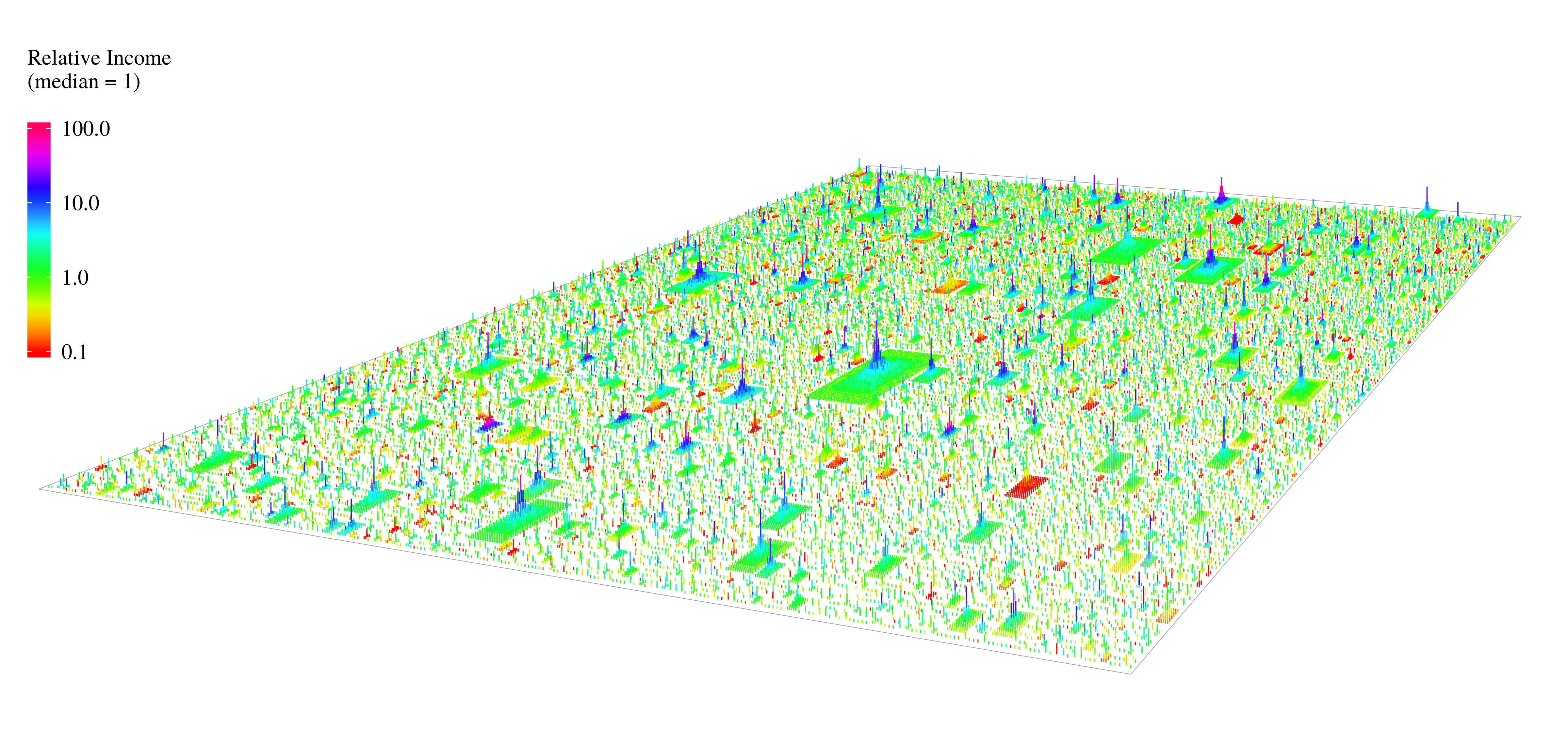
Figure 1: The US hierarchy model as a landscape. Each pyramid represents a firm. Size indicates the number of employees. Moving up the pyramid represents moving up the hierarchy. Color indicates individual income.
The purpose of the model is to indirectly study how hierarchy affects income. It works like this. First, we use the model to predict an income effect that is caused by hierarchy. Then we look for this effect in the real world. If we find it, we infer that real-world income grows with hierarchical rank as it does in the model.
We can use the model to make many different types of predictions. In a recent paper, for instance, I predicted that top-earning individuals should work for large firms. Then I showed that in the real-world, top-earning individuals actually do work for large firms, just as predicted.
In this post, I study how job frequency changes with income. I first use the model to predict how the frequency of three classes of employees should vary by income. Then I look for the predicted trends in real-world data.
Three classes of employee
Large hierarchies have many ranks. But because I’m going to use coarse-grain information (job titles) to infer hierarchical rank, here I’m interested in three broad classes:
- Low-ranking employees
- Mid-ranking employees
- Top-ranking employees
As the names suggest, these classes relate to position in a hierarchy. Low-ranking employees are at the bottom of the hierarchy. Mid-ranking employees are in the middle. And top-ranking employees are at the top.
With these classes in mind, here’s the road map ahead. First, I’m going to use the hierarchy model to predict how the frequency of each class of employee should vary with income. Then I’ll show that this variance is due to hierarchy. Last, I’ll look for the predicted trends in real-world data (on the Ontario Sunshine List).
Predictions
Low-ranking employees are less frequent as income grows
Low-ranking employees are the poor saps (like me) who work at the bottom of hierarchies. They’re the red individuals in Figure 2.
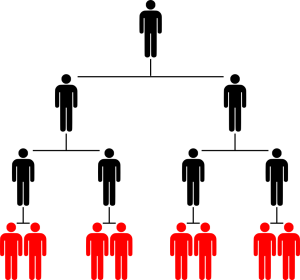
Figure 2: Low-ranking employees in a hierarchy
Before getting to quantitative predictions, let’s first think qualitatively. How might the frequency of low-ranking employees change with income? If income grows rapidly with rank, low-ranking employees should be mostly at the bottom of the distribution of income. So low-ranking employees should become less frequent as income grows.
Figure 3 shows our quantitative prediction. On the horizontal axis I’ve plotted income percentile. For each percentile, the vertical axis shows the relative frequency of low-ranking employees.

Figure 3: Frequency of low-ranking employees by income percentile. The horizontal axis shows income percentile in the model. The vertical axis shows the relative frequency of low-ranking employees within each percentile.
As expected, the model predicts that low-ranking employees become less frequent as income increases. Almost everyone in the bottom 1% is a low-ranking employee. But almost no one in the top 1% is a low-ranking employee.
Figure 4 shows a different way of looking at the same prediction. Instead of plotting income percentile, on the horizontal axis I plot income size (relative to the average income). Note that I’ve used a logarithmic scale, so each axis tick indicates a factor of 10.
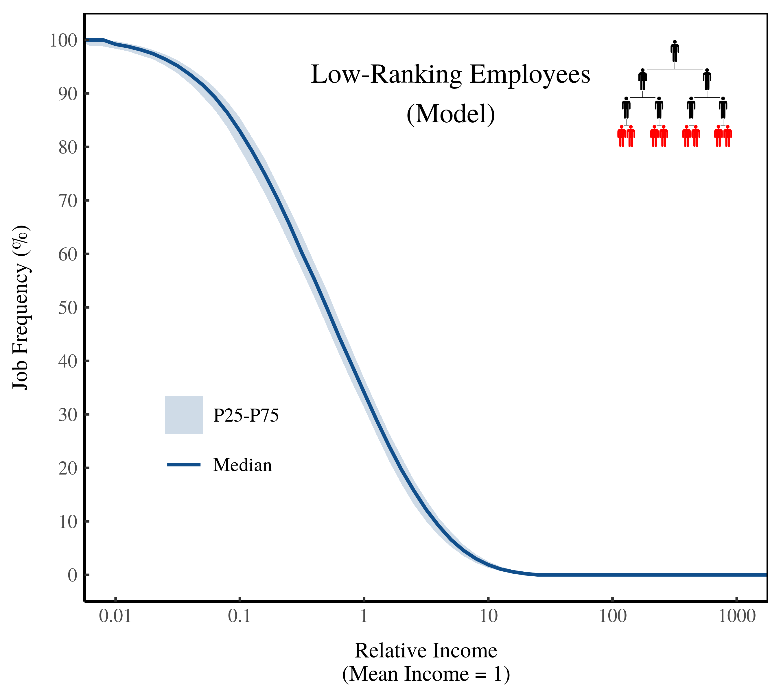
Figure 4: Frequency of low-ranking employees by income size. The horizontal axis shows income in the model (relative to the mean). The vertical axis shows the relative frequency of low-ranking employees at the given income.
Again, we find that low-ranking employees become less frequent as income increases. Almost everyone who earns less than 10% of the average income is a low-ranking employee. Conversely, almost no one who earns more than 10 times the average income is a low-ranking employee.
Mid-ranking employees are most frequent in the middle
Mid-ranking employees work in the middle of hierarchies. While the exact rank of these workers is open to interpretation, here I assume that they work in the second hierarchical rank.
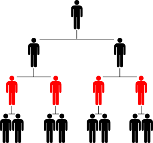
Figure 5: Mid-ranking employees in a hierarchy
Although mid-ranking employees are only one step above low-ranking employees, our model predicts that they are dispersed quite differently in the distribution of income.
Figure 6 shows the prediction for mid-ranking employees. These workers are most frequent in the middle 80% of incomes. They’re rare below the 10th percentile and above the 90th percentile.
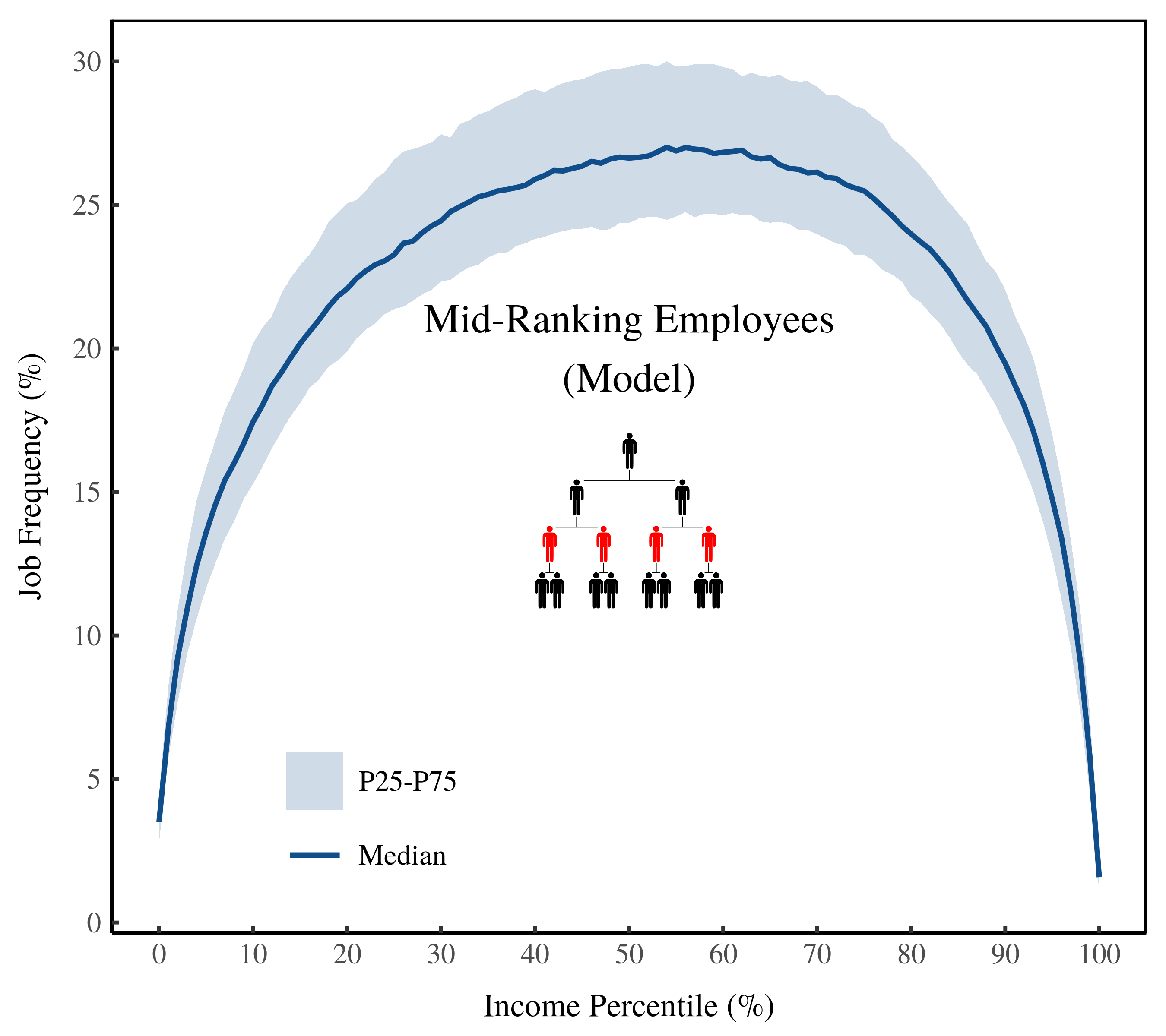
Figure 6: Frequency of mid-ranking employees by income percentile. The horizontal axis shows income percentile in the model. The vertical axis shows the relative frequency of mid-ranking employees within each percentile.
Figure 7 shows the same prediction, but this time plotting income on the horizontal axis. The model predicts that mid-ranking employees are most frequent around the average income. Again, this tells us that mid-ranking employees are the middle class.

Figure 7: Frequency of mid-ranking employees by income size. The horizontal axis shows income in the model (relative to the mean). The vertical axis shows the relative frequency of mid-ranking employees at the given income.
Top-ranking employees are more frequent as income grows
Top-ranking employees work at the top of their respective hierarchies. Figure 8 shows a top-ranking employee in a small hierarchy.
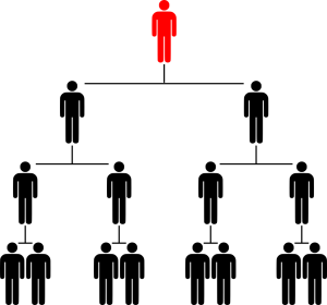
Figure 8: A top-ranking employee in a hierarchy
Moving from the middle to the top of the hierarchy may seem like a small shift. Yet it drastically changes how individuals are dispersed in the distribution of income.
Our model predicts that top-ranking employees are located overwhelmingly at the top of the distribution of income. As Figure 9 shows, few people below the 99th percentile are top-ranking employees. But above the 99th percentile, almost everyone is a top-ranking employee.
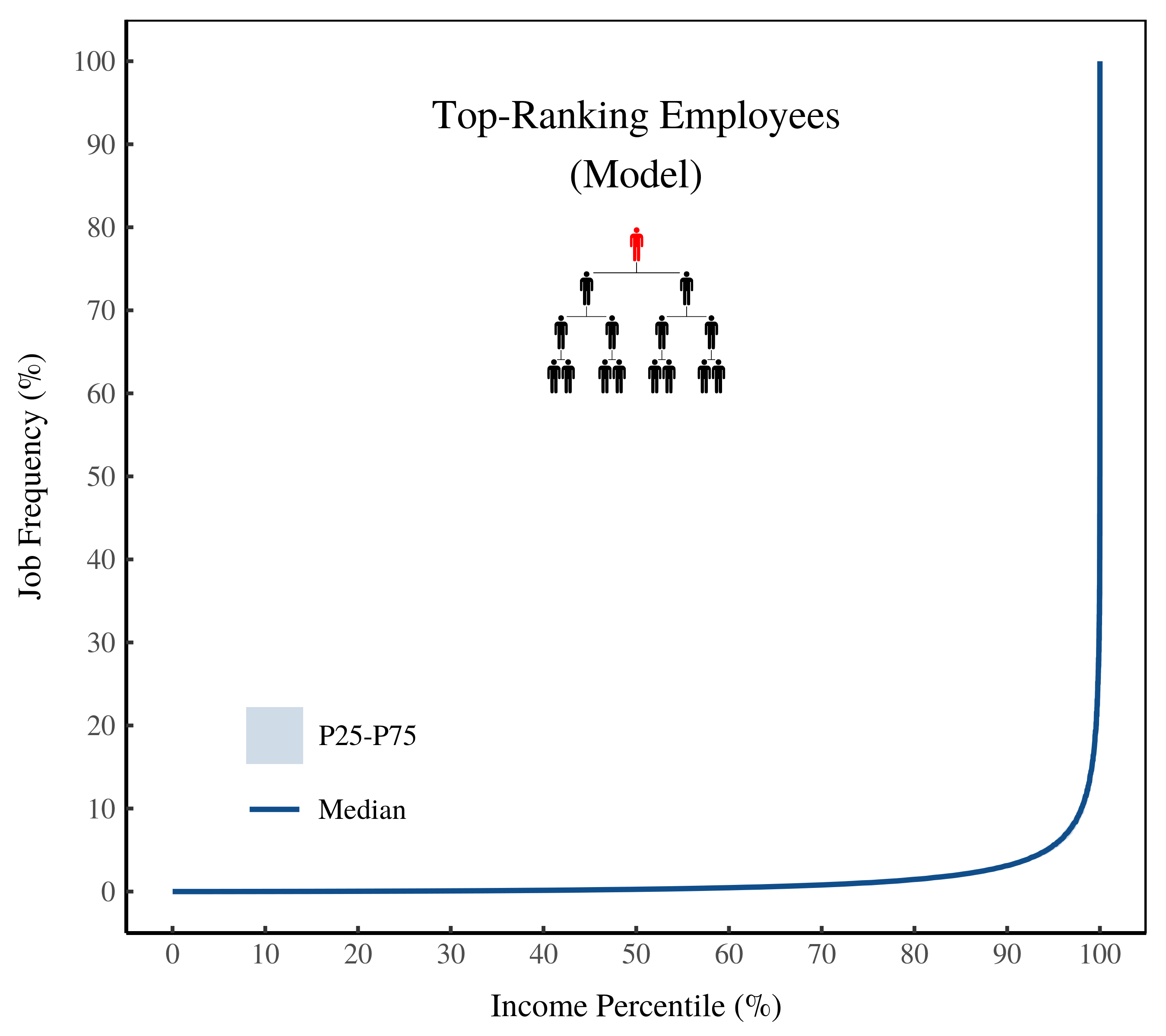
Figure 9: Frequency of top-ranking employees by income percentile. The horizontal axis shows income percentile in the model. The vertical axis shows the relative frequency of top-ranking employees within each percentile.
Figure 10 (below) shows how this explosion of top-ranking employees relates to income size. Below the average income, almost no one is a top-ranking employee. This changes at about double the average income, where the frequency of top-ranking employees begins to grow.

Figure 10: Frequency of top-ranking employees by income size. The horizontal axis shows income in the model (relative to the mean). The vertical axis shows the relative frequency of top-ranking employees at the given income.
At 100 times the average income, half the people are top-ranking employees. At 1000 time the average income, virtually everyone is a top-ranking employee.
In hindsight, this prediction is easy to understand. We’ve assumed that income grows rapidly with hierarchical rank. Flipping things around, this means that if you have a large income, you likely have a high rank. And the higher your rank, the more likely it is that you sit at the top of your hierarchy. [1] The result is that top-ranking employees become more frequent as income grows.
Yes, these predictions stem from hierarchy
Before we test our predictions against real-world evidence, we want to be sure that these predictions actually stem from hierarchy. The way we’ll do this is by simulating a counterfactual world. In this world there are no returns to hierarchical rank. So CEOs earn no more than bottom-ranked employees.
As Figure 11 shows, the results of this counterfactual model are strikingly different than the original model.

Figure 11: A counterfactual world with no returns to hierarchical rank. This figure shows the results of two models. One model has income returns to hierarchy, the other does not.
In a world with no returns to hierarchical rank, our model predicts that job frequency shouldn’t vary by income. Our three classes of employees are equally frequent for all incomes. This stands in marked contrast to our original model. It’s only when there are returns to hierarchical rank that our predictions hold. Only then do top-ranking jobs explode among top incomes.
The Ontario Sunshine List
To test our predictions, I’m going to use the Ontario Sunshine List. Created in 1996, the Sunshine List discloses the salaries of all public-sector employees in Ontario who earn more than $100,000.
The Sunshine List is unique for two reasons. First, it’s a complete list of top-earning workers in the Ontario public sector. Second, the database isn’t ‘top coded’. Top coding is the practice of capping the size of incomes that you report. In many databases, for instance, incomes are top coded at $100,000. So anyone who earns more than this amount gets reported as earning ‘more than $100,000’.
Top coding is used to shield the identity of survey respondents. But because the Ontario Sunshine List was created to reveal the identity of top earners, it reports top incomes in full. This is important because we’ve predicted that the most spectacular effects of hierarchy occur among top earners.
To test our predictions, I pick three jobs that appear on the Sunshine List and equate them with the three classes of workers used in the model. Here are my choices:
| Class in Model | Sunshine List Job |
| Low-Ranking Employee | ‘Nurse’ |
| Mid-Ranking Employee | ‘Professor’ |
| Top-Ranking Employee | ‘President/CEO’ |
‘Nurses’ on the Ontario Sunshine List
I use ‘nurses’ to represent low-ranking employees. The caveat here is that nurses in Canada are paid fairly well — far better than other low-ranking jobs like ‘janitor’. I choose ‘nurse’ because it’s a low-ranking job that pays well enough to appear on the Sunshine List.
Figure 12 shows the results. I find that the frequency of nurses declines as income increases — just as the model predicts.
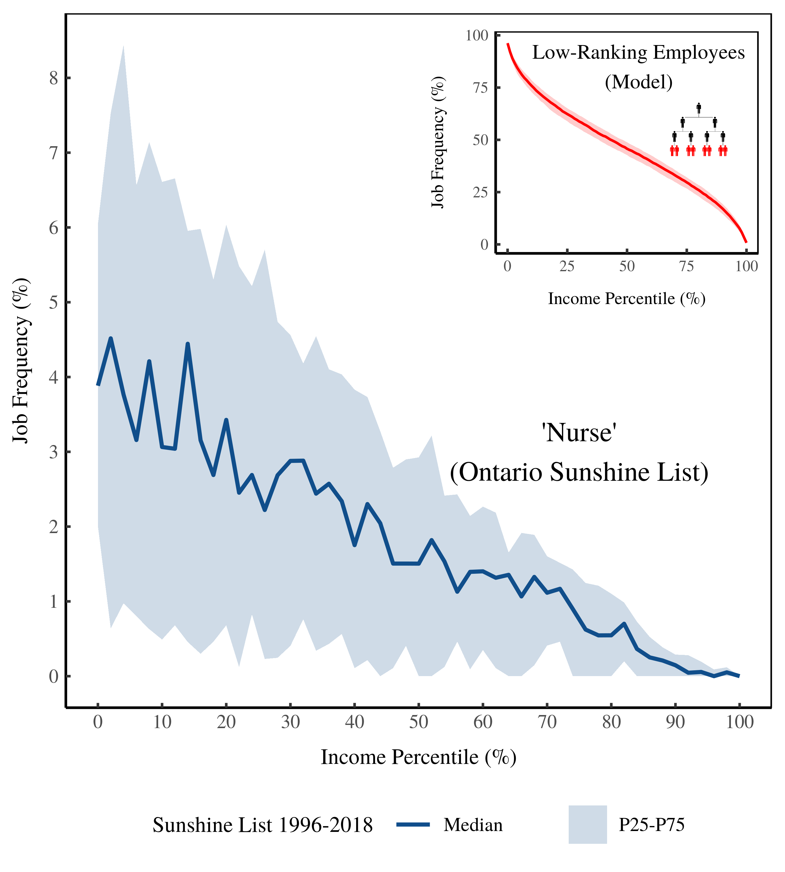
Figure 12: Frequency of ‘Nurse’ on the Ontario Sunshine List by income percentile. The horizontal axis shows income percentile on the Sunshine List. The vertical axis shows the relative frequency of ‘nurses’ within each percentile. The inset plot shows the model predictions.
A caveat is that the empirical data in Figure 12 isn’t directly comparable to the model. In the model, income percentiles rank all individuals. But in the empirical data, income percentiles rank only the members of the Sunshine List (public-sector employees earning more than [/latex]100K).
Figure 13 (below) shows the same data, but plots job frequency against income size. The frequency of nurses declines rapidly as income grows. Most Ontario nurses (on the Sunshine List) earn close to the average Canadian income. Almost none earn more than twice the average income. Our model predicts a similar trend — the frequency of low-ranking employees should decline rapidly as income grows.
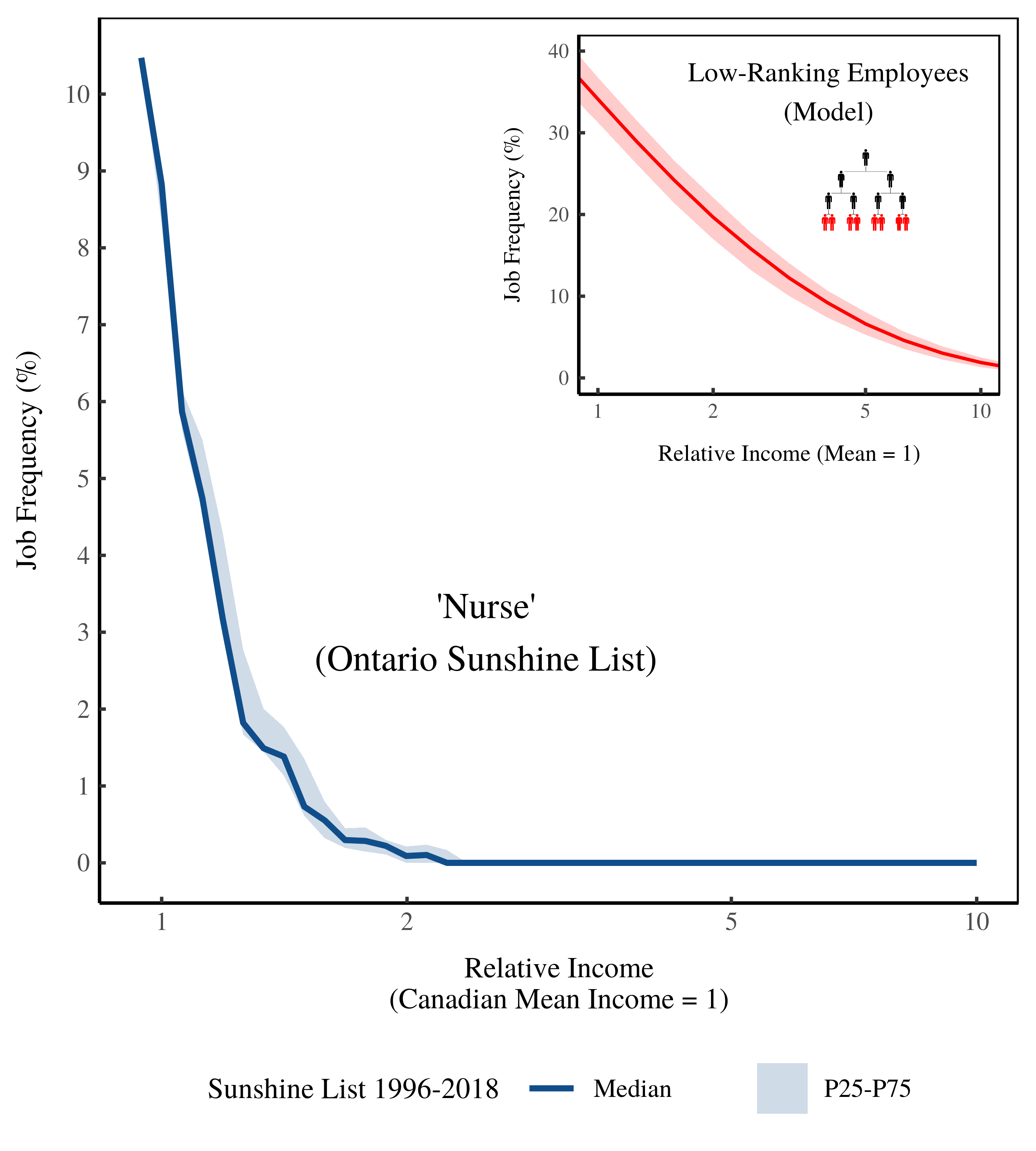
Figure 13: Frequency of ‘Nurse’ on the Ontario Sunshine List by income size. The horizontal axis shows income relative to the Canadian average. The vertical axis shows the relative frequency of ‘nurses’ on the Ontario Sunshine List. The inset plot shows model predictions. [2]
‘Professors’ on the Ontario Sunshine List
I use ‘professors’ to represent mid-ranking employees. In Canadian universities, professors often command a few subordinates (in the form of teaching assistants and post docs). Professors also have some administrative power through faculty senates.
Figure 14 shows how the frequency of ‘professors’ changes with income on the Sunshine List. Unlike nurses, the frequency of professors is roughly constant with income percentile. This is similar to the predicted behavior of mid-ranking employees (inset).
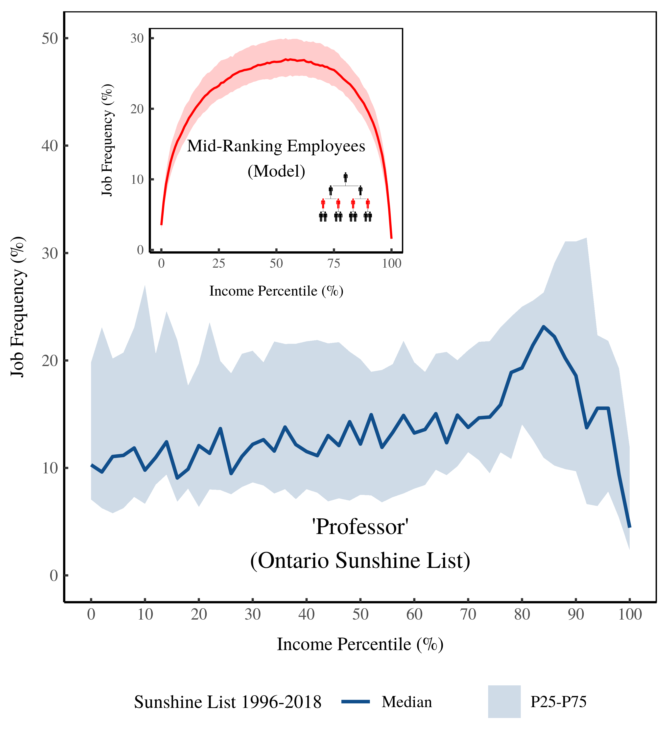
Figure 14: Frequency of ‘Professor’ on the Ontario Sunshine List by income percentile. The horizontal axis shows income percentile on the Sunshine List. The vertical axis shows the relative frequency of ‘professors’ within each percentile. The inset plot shows model predictions.
Figure 15 (below) shows the same data, but plots job frequency against the size of income. Most Ontario professors (on the Sunshine List) earn between 1 and 5 times the Canadian average. In this case, the model isn’t particularly accurate. It predicts the tapering of mid-ranking employees for large incomes, but it doesn’t predict the tapering (evident among professors) for incomes close to the average.
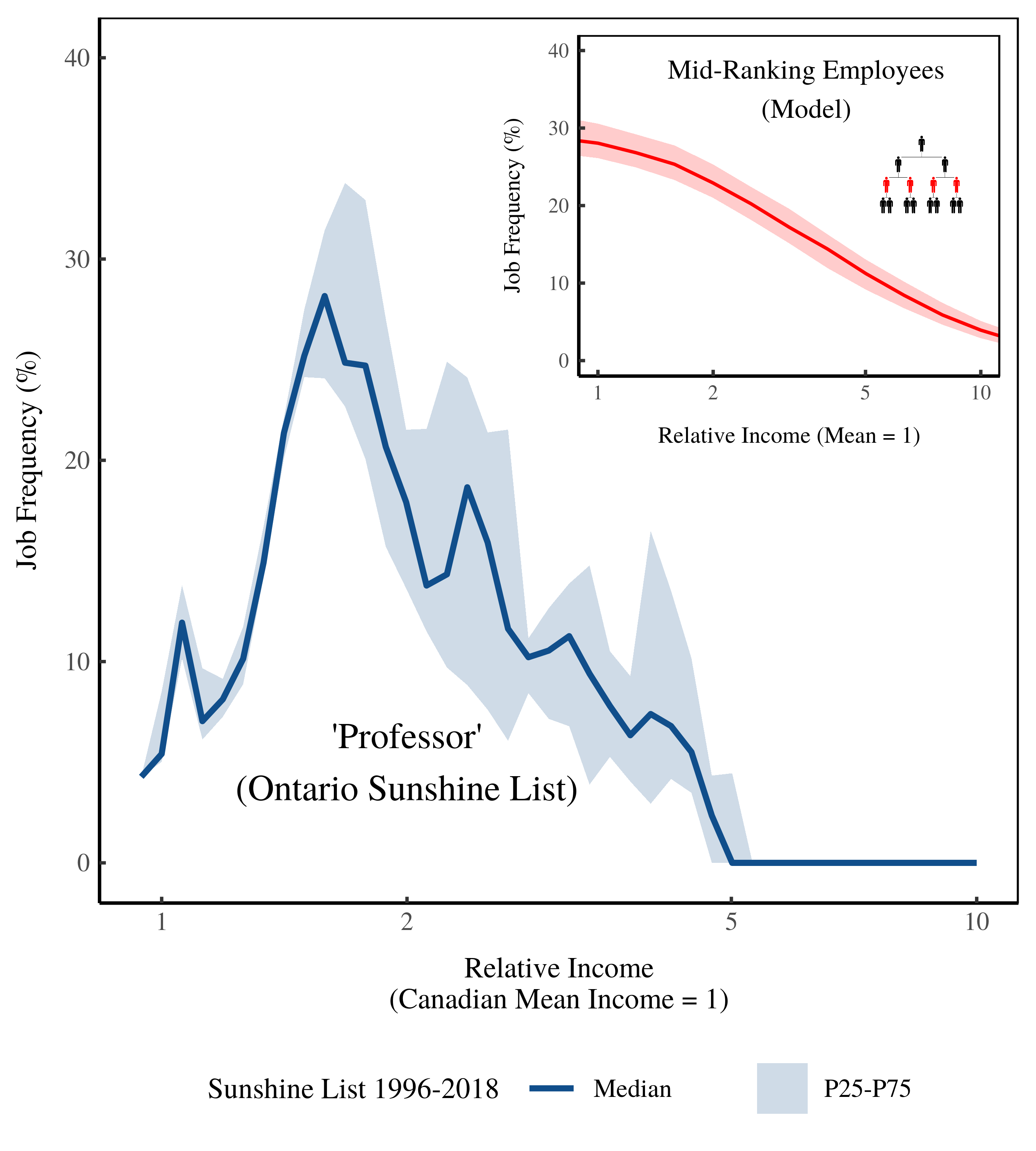
Figure 15: Frequency of ‘Professor’ on the Ontario Sunshine List by income size. The horizontal axis shows income relative to the Canadian average. The vertical axis shows the relative frequency of ‘professors’ on the Ontario Sunshine List. The inset plot shows model predictions. [2]
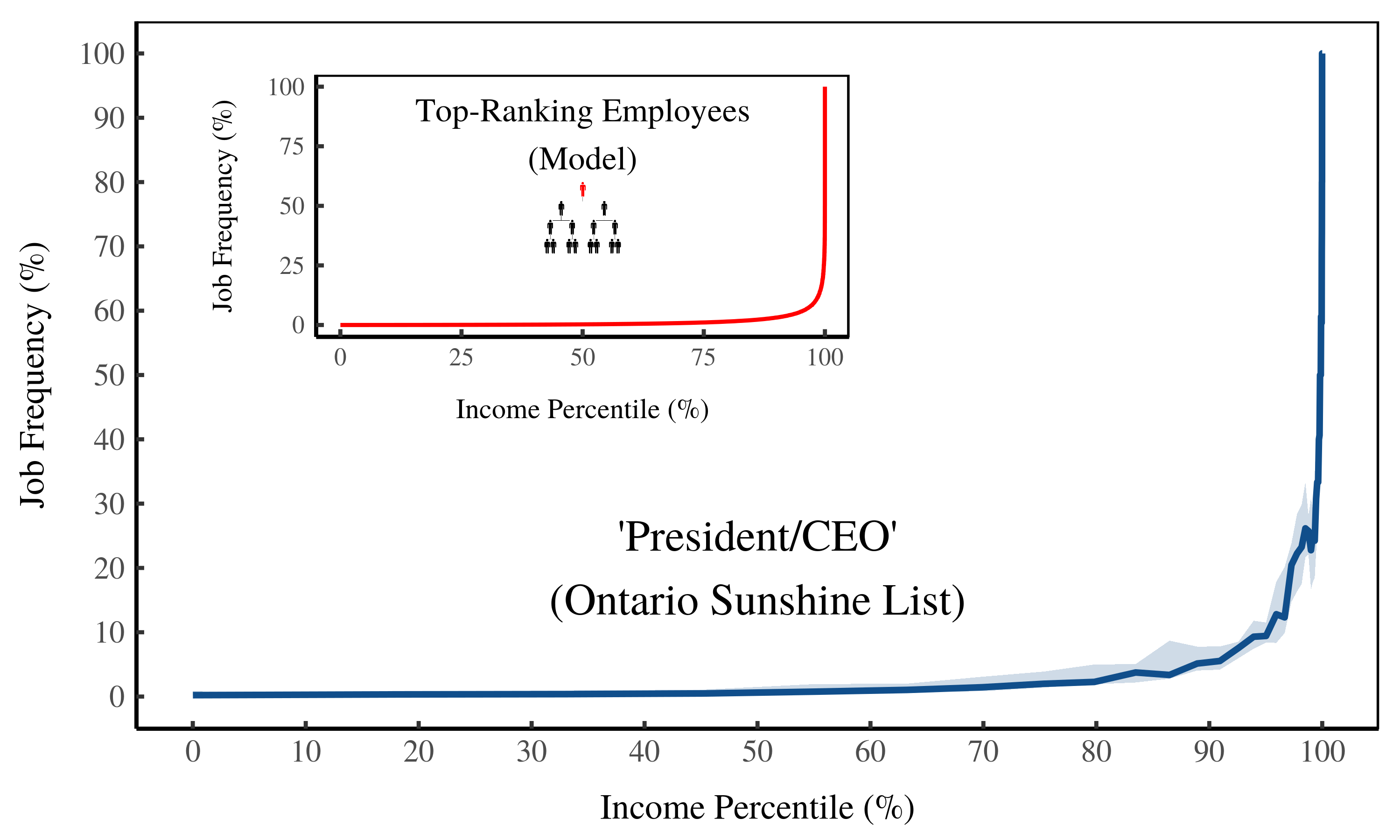
‘Presidents/CEOs’ on the Ontario Sunshine List
I use ‘presidents/CEOs’ to represent top-ranking employees. Figure 16 shows the trends on the Ontario Sunshine List. Among the bottom 99%, almost no one is a CEO. But among the top 1% (of Sunshine earners), CEOs are ubiquitous. This explosion of top-ranked employees is exactly what our model predicts (inset).

Figure 16: Frequency of ‘President/CEO’ on the Ontario Sunshine List by income percentile. The horizontal axis shows income percentile on the Sunshine List. The vertical axis shows the relative frequency of ‘presidents/CEOs’ within each percentile. The inset plot shows model predictions.
Figure 15 (below) shows the same data, but plots job frequency against the size of income. Below average income, CEOs are basically non-existent. But as income reaches 10 times the Canadian average, CEOs become ubiquitous — approaching 100% of of Sunshine-List members.
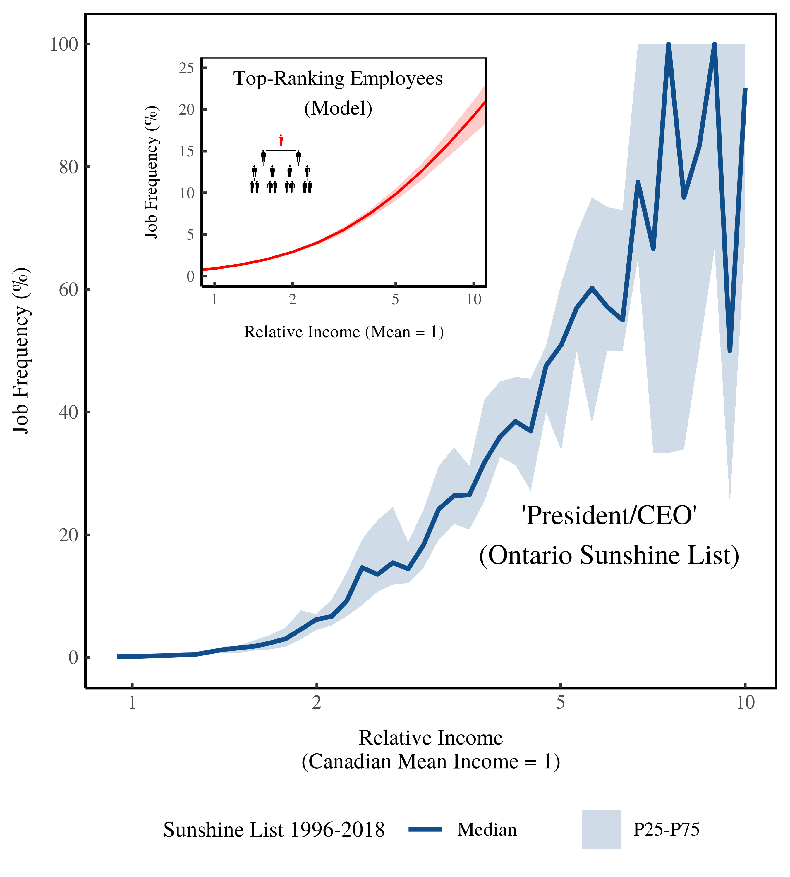
Figure 17: Frequency of ‘President/CEO’ on the Ontario Sunshine List by income size. The horizontal axis shows income relative to the Canadian average. The vertical axis shows the relative frequency of ‘presidents/CEOs’ on the Ontario Sunshine List. The inset plot shows model predictions. [2]
The model (inset) predicts this explosion of top-ranking employees. However, the model predicts the saturation of top-ranking employees at about 500 times the average income (see Figure 10). In contrast, saturation on the Sunshine List happens at 10 times the average income.
Why the discrepancy? It’s because the model is based on the US private sector, where pay is far more unequal than in the Canadian public sector. Top US CEOs often earn hundreds of times the average income. In contrast, top public-sector CEOs in Canada rarely earn more than 10 times the average income.
The key here is that top-ranking employees become ubiquitous among the largest incomes — however large these may be.
A new window into hierarchy?
I’m excited by these results for a few reasons. First, there’s something tantalizing (and insidious) about knowing that CEOs become ubiquitous among top earners. It shows that all jobs are not created equal.
What’s more exciting is that we can predict this trend using a simple model of hierarchy. If income grows with hierarchical rank, then top-ranking employees will become ubiquitous as income grows. There’s no way around this prediction — it’s a basic consequence of hierarchy.
But what’s most exciting are the doors opened for future research. Hierarchy surrounds us. Yet we know virtually nothing about it. The results here suggest that evidence for how hierarchy affects income is staring us in the face. It’s sitting there (waiting to be analyzed) in any dataset that records income and job titles.
Notes
[1] As rank grows, why is it more likely that you sit at the top of your hierarchy? This results from a joint property of hierarchies and the size distribution of firms.
Imagine two people, Alice and Bob. They both have a rank of 8. But Alice is the CEO of her firm, while Bob is a Vice President in his firm. How common are our hypothetical Alice and Bob?
It turns out that someone like Alice is far more common than someone like Bob. This is because hierarchies tend to grow exponentially with the number of hierarchical levels. Because Bob’s firm has one more hierarchical level than Alice’s firm, we’ll guess that its roughly double the size.
Now, the size distribution of firms follows a power law. The probability of finding a firm of size x is roughly proportional to the inverse square of x (see this post for more details). This means that Bob’s firm, which is twice as large, is about 4 times rarer than Alice’s firm.
So even though Alice and Bob have the same rank, our hypothetical Alice is about 4 times more common than our hypothetical Bob (because the size of her firm is about 4 times more common). The result is that as your rank grows, it becomes increasingly probable that you occupy the top rank in your firm.
[2] I calculate average Canadian income by dividing GDP by the size of the labor force (using World Bank series NY.GDP.MKTP.CN and SL.TLF.TOTL.IN).
Further reading
Fix, B. (2018). Hierarchy and the Power-Law Income Distribution Tail. Journal of Computational Social Science, 1(2), 471–491. SocArXiv Preprint.
Fix, B. (2019). How the Rich Are Different: Hierarchical Power as the Basis of Income Size and Class. SocArXiv Preprint.
Fix, B. (2019). Personal Income and Hierarchical Power. Journal of Economic Issues. 2019; 53(4): 928-945. SocArXiv Preprint.