- This topic has 57 replies, 5 voices, and was last updated June 30, 2023 at 5:36 pm by Adam Marshall.
-
CreatorTopic
-
December 18, 2020 at 10:36 am #245118
Hi all,
I’m a newbie to both the forum and CasP. Although I only stumbled across the CasP literature a couple of days ago (and have therefore only read a tiny fraction of it), I find the core arguments intriguing and persuasive. So much so that I am seriously considering using CasP as my main theoretical approach- even at this VERY late stage in my PhD research (I am currently in the early stages of writing up my findings!). Based on ethnographic fieldwork with anti-fracking activists and online (qualitative) data collection , my PhD research seeks to explore, understand and explain the fracking conflict in the UK, its political-economic drivers and the strategies deployed by key actors. I was planning to base my analysis on Marxist political economy and make my contribution to the literature on ecological distribution conflict. However, since discovering the CasP approach, I have been debating whether or not to throw my lot in with CasP (instead of Marxism). I’m not 100 per cent decided, but I think CasP might be a better fit for my case study.
Up to now, my research has been qualitative and theoretical. However, it is my understanding that CasP research usually contains a significant amount of quantitative analysis. At this late stage, I do not have the time to learn advanced econometrics or to do a wide-ranging quantitative analysis. However, I think it might be possible (and useful) to supplement the qualitative data I already have with some new quantitative analysis looking at changes in the differential capitalization of key oil and gas exploration firms (or the entities that own them) over the duration of this conflict. It is worth noting that many of the companies involved are speculative companies, often owned by bigger entities such as private equity firms and investment banks (See for example: https://unearthed.greenpeace.org/2015/12/16/revealed-cuadrilla-and-leading-fracking-firms-tax-haven-ownership/).
With this in mind, I am posting to get your thoughts on the following questions:
(a) Do you think it would be feasible to undertake this sort of analysis within say the next 2-3 months?;
(b) If you think (a) is feasible, it would be great to get some pointers on where I might find the relevant data and how best to go about analysing it?
(c) If you do not think (a) is feasible, what are your views on qualitative CasP research. Is such a thing possible?
Thanks a lot for your time. Any thoughts/comments would be greatly appreciated.
All the best,
Adam 🙂
-
CreatorTopic
-
AuthorReplies
-
-
December 18, 2020 at 11:03 am #245119
Just to add. I am not trained in political economy or econometrics. I am an interdiciplinary social researcher with an interest in the political economy of the environment and environmental conflict. I have received some basic training in quantitative social research methods, but I do not consider myself to be an expert. I have an MSc in sustainability and ecologcial economics from Leeds University where I took a couple of political economy classes. My undergraduate degree in in history, politics and international relations (Nottingham Trent University). I am undertaking my PhD at Manchester Met (in the UK). Thus far, I have published one paper (based on my MSc dissertation on a local currency): https://e-space.mmu.ac.uk/619743/1/BP%20Paper%20finalpdf.pdf
-
December 18, 2020 at 12:04 pm #245120
Hi Adam,
Here’s my two cents.
First, empirical work is slow going, especially if you’re new to it. You need to find the data, learn how to use it. And if you’re completely new to empirical work, learn the basics of data analysis. These are all things that take time to learn and you do not want to rush. If you had lots of experience, I’d say 2-3 months is lots of time. But since it sounds like you’re new to quantitative work, that’s very little time. You also have to keep in mind that you might not find what you wanted (i.e. the empirical evidence may contradict the arguments you’re making).
For all of these reasons, my gut feeling is that trying to do good-quality empirical work for your PhD thesis will take more time than you have. It may be better to delay this work for when you publish your PhD research. Then you can take the time you need.
I’m curious what other CasP researchers think.
Blair
-
December 18, 2020 at 6:45 pm #245124
Hi Blair,
Thanks a lot for sharing your thoughts. What you say makes a lot of sense. I would be interested to hear people’s thoughts on my third question regarding the possibility of using CasP as a theoretical frame to make sense of qualitative research data. I guess this would be difficult given the emphasis on quantifying power in terms of differential capitalization.
For the anti-fracking activists I interviewed during my fieldwork, a key goal of their campaigning was to sap investor confidence in the fracking companies causing their share prices to tumble. Although the activists weren’t so focused on market cap, I think it would be interesting to examine how key firms’ market caps (and share prices) responded to certain protests and other events that challenged pro-fracking narratives (e.g. fracking-induced earthquakes in Lancashire). Like you say though, this research will probably have to wait until after the PhD.
Best wishes,
Adam -
December 19, 2020 at 4:48 pm #245131
Thanks for your posts Adam.
1.
Irrespective of your theoretical approach and whether you will be able to incorporate it in your PhD dissertation, empirical analysis is important. In many cases it’s essential. Without it, you often end up wandering in the dark, getting your cues from other blindfolded writers who in turn get theirs from other blindfolded experts. From my own experience, empirical analysis is important for the answers it gives, but more so for the questions it raises. It will likely change your research trajectory many times over, and in ways that cannot be achieved without it.
One of my former graduate students was once advised by a Marxist professor to not engaged in empirical work. Empirical work, the professor observed, can get you entangled (in other words, prove your Marxist theory wrong).
But what dogmatic adherents cannot risk, scientists must.
2.
I think that DT Cochrane has done some work on the triangle of differential accumulation, risk and activism. Perhaps he can contribute something to this exchange.
- This reply was modified 5 years, 7 months ago by Jonathan Nitzan.
-
December 19, 2020 at 8:34 pm #245133
Hi Jonathan,
Thank you for your reply. I fully agree with your comments on the importance of empirical research. I also think the Marxist professor’s advice was ridiculous. Perhaps I didn’t make this clear, but My PhD project is based on empirical research. I spent around a year in the field conducting participant observation with anti-fracking campaigners, conducting interviews, attending industry conferences, collecting company documents, newspaper articles, social media posts etc. These sorts of (qualitative) methods produce very different types of data than quantitative methods, but they are equally empirical. Both types of methods have their place. For example, quantitative methods could tell you that Foxconn have a huge problem with workers committing suicide in their factories. Qualitative methods could help you explain what is driving this situation.
I’m not sure what your thoughts are on this, but I am of the view that data rarely speaks for itself. It always has to be interpreted using theory – whether our own or someone else’s. Depending on the results of the empirical work, we can confirm, refine or discard our working theory (or produce a new one like you did with CasP!).
DT Cochrane’s work sounds really interesting. Thanks for recommending it. I’ll be sure to check it out.
Best wishes,
Adamp.s. apologies if I have misinterpreted your point about empirical research 🙂
-
December 19, 2020 at 11:52 pm #245134
You haven’t misinterpreted anything, Adam: qualitative research is as important as quantitative research, and facts always require theoretical interpretations — just as theory can rarely stand without empirical work.
-
December 21, 2020 at 11:17 am #245137
I couldn’t agree more Jonathan!
Like I said earlier, I am very new to the CasP approach and am still trying to decide where I stand on it. Reading the CasP literature has been an unnerving experience. This is because it has caused me to question many ideas and concepts which have been central to my thinking on political economy for a few years now (e.g. financialiation, fractions of capital, rent, capital as value in motion based on expanded production, circulation and distribution). To come to an informed conclusion, I am trying to read arguments both for and against CasP. With this in mind, I would be really grateful to get your thoughts on a particular critique of CasP made in a paper by Mazzen Labban (see link below):
Labban, M., 2010. Oil in parallax: Scarcity, markets, and the financialization of accumulation. Geoforum, 41(4), pp.541-552.
Labban’s paper, which is based on a Marxian understanding of financialization (a concept I know you find problematic), focuses on the role of financialization and production in accumulation in oil markets. While CasP is not the paper’s main focus, Labban dedicates a few paragraphs to explaining and critiquing CasP’s argument that ‘capital is only finance’ (p.549-50). I have copied and pasted the relevant paragraphs below. I have a feeling he may have misrepresented your position on the role of production in accumulation. With this in mind, I’d be really grateful to get your thoughts on Labban’s depiction of your work and the specific arguments he makes viz a viz accumulation in the oil industry. Thank you in advance:
To what extent has capital accumulation in the oil sector superseded the production and realization of value in the production and exchange of oil? Has capital accumulation been completely liberated from production? This seems to be the conclusion drawn from reading Nitzan and Bichler, whose rich work deserves a much closer and extended critique than the space of this article duly allows. For Nitzan and Bichler (2006, p. 18; see also Nitzan and Bichler, 2009), there is no ‘real’ value lurking behind fictitious capital. Fictitious capital is real capital; real value is market value. The value of a corporation on the stock market, its market capitalization, derives from perceptions about its ‘ability to generate profit’ rather than the value of its material assets, which is practically impossible to determine. Accumulation, on this view, is not amassment of material stock for productive purposes, but accumulation of paper assets whose value derives from the stock market. Wealth takes the form of ‘financial claims on expected future earnings’ (Bichler and Nitzan, 2004, p.256). Modern ownership is ‘only financial’—‘capital is finance, and only finance’ (Nitzan and Bichler, 2002, p. 36).
Capital to Nitzan and Bichler is power, not simply an economic process. Dominant capital is the coalition of capitalists that succeeds in achieving differential accumulation, i.e. ensures that its profits and assets (market capitalization) not simply grow in absolute terms, but grow faster than the average. Dominant capital achieves differential accumulation through two primary methods: breadth, increasing the size of the corporation (measured by number of employees); and depth, the measure of dollar earnings (profit and/or interest) relative to the size of the corporation. The first has been carried increasingly through merger and acquisition rather than greenfield investment, while the latter through ‘differential inflation’, or stagflation, raising prices faster than the average rather than increasing production or cost cutting.
There are two contradictions in this argument that prevent it from making the salto mortale out of material production. First, although ownership and wealth are located entirely in the stock market, where the value of a corporation derives entirely from the market perception of its ability to generate profit in the future, this very ability is associated with the corporation’s power over material production and exchange, exercised through corporate amalgamation. Indeed, this is where dominant capital appears as political power and not just an economic process, in its ability to break ‘ownership envelopes’ and expand its control over productive capacity and employment, as well as its ability to induce differential inflation while cutting production (see Nitzan and Bichler, 2009, pp. 327–333). Second, although production is written out from the process of accumulation, oil companies are still construed as buyers of crude oil (traders, to be accurate, according to the analysis above) though not producers (Nitzan and Bichler, 2006, p. 70). This implies that oil has to be produced somewhere at some time and that investment in the production of crude oil and refined products has to take place (mostly by major oil companies in the latter case). Production however is only the first act in the generation of profit, which is only complete in the second act of realization in exchange—the critical moment at which the commodity is sold. Hence, oil companies must also be sellers of oil and refined products. This act is necessary for Nitzan and Bichler’s argument regarding inflation as a strategy of accumulation, for this must imply the sale of the commodity at some time, no matter how much the profits of oil companies have come to depend on high prices rather than volume of sale.
Oil companies continuously invest in upstream and downstream production and reserve expansion, mobilizing placements as finance along with purely financial investments. The relation between finance and investment has changed over time, but so far the one has not replaced the other. To take one example, ExxonMobil’s investments (expenditures on capital and exploration) grew in absolute terms with the surge in oil price in recent years, but have changed only slightly relative to income (Table 1).34 Most remarkably, stock buyback grew in relation to income and to investment in both absolute and relative terms. The greatest increase is in the growth of stock buyback relative to stock sales: less funds are raised from sale of stock relative to borrowing on financial markets (debt in 2008 remained the same as in 2003, around $9.5 billion) at the same time that more income goes to buy back stock and to shareholders as dividends in comparison with investment.35 The general trend towards finance is reflected in the increase in the ratio of financing (debt, dividends and buybacks) to investment expenditures (greenfield and equity), keeping in mind that the boundaries between the two have become increasingly blurred.
-
December 21, 2020 at 9:55 pm #245138
Labban asks: “Has capital accumulation been completely liberated from production? This seems to be the conclusion drawn from reading Nitzan and Bichler.”
Hmmm.
I have no idea where Labban concocts this claim from. It certainly doesn’t come from us, or from any CasP work I know of.
Our research reiterates, again and again, that capital is not about production, but about the control of production. But that doesn’t delink capital from production. Indeed, the very purpose of CasP research – our own as well as that of others — is to understand the ways in which capital creorders – or creates the order of – society, including its productive activity.
Now, given that capital is partly about the control of production, it is rather obvious – although not to Labban — that it cannot be ‘liberated’ from it.
But, then, maybe I misunderstand Labban’s misunderstanding….
- This reply was modified 5 years, 7 months ago by Jonathan Nitzan.
- This reply was modified 5 years, 7 months ago by Jonathan Nitzan.
- This reply was modified 5 years, 7 months ago by Jonathan Nitzan.
-
December 22, 2020 at 7:22 pm #245142
Thanks Jonathan. I thought it was a misrepresentation of your position, but it’s really useful to have you confirm that.
Cheers,
Adam -
December 22, 2020 at 9:47 pm #245143
We just posted a new WPCASP, titled ‘The Limits of Capitalized Power: A 2020 Update’ http://bnarchives.yorku.ca/663/. The paper shows the significance of strategic sabotage for the distribution of income between capital and labour and between large and small firms. The purpose of strategic sabotage is to control production (among other things), so as to redistribute income and assets. If capitalists ‘liberated’ themselves from this process, how could they control it?
Reading suggestions:
- If you need the Full Monty, the place to start is our 2009 book: http://bnarchives.yorku.ca/259/
- A shorter up-to-date summary is offered in this botched interview: http://bnarchives.yorku.ca/640/
- A 2018 summary of CasP research — including the research of others — is given here: http://bnarchives.yorku.ca/536/
- This reply was modified 5 years, 7 months ago by Jonathan Nitzan.
- This reply was modified 5 years, 7 months ago by Jonathan Nitzan.
-
December 23, 2020 at 7:16 pm #245151
Thanks for the suggested readings Jonathan. They should keep me busy over the Christmas break! I hope you don’t mind, but I have a few more questions about CasP:
1. Do you know of any papers/books that analyse the crisis of 2007-08 through the lens of CasP? Like many of my generation, my interest in political economy was sparked during this period. However, I’ve only really read Marxist, post-Keynesian and classical analyses of the financial crisis so would be interested to see how different a CasP analysis might be.
2. If I understand correctly, a lot of CasP research focuses on large publicly listed corporations, using their market capitalizations as a proxy for power. How would you go about assessing the power of organisations for which market cap data doesn’t exist (e.g. privately owned corporations, hedge funds, private equity firms etc.). If you have answered this question elsewhere, please could you direct me to the relevant paper/chapter?
3. During the course of my research on the UK fracking conflict, I learned that it is very common for large private equity firms to invest in small oil/gas exploration companies that have yet to make money or be listed on a stock exchange. Sometimes they take equity in a firm that is small/medium-sized and already listed on a stock exchange. I’m thinking aloud here (so aren’t necessarily expecting a solid answer), but I’m just wondering how easy it is to do a CasP analysis when the powerful/controlling interest is a private entity (i.e. a private equity firm) who own a public company that is weak on paper with a low market cap?
Apologies if that last question is a bit rambling. Like I said, I’m thinking aloud and not expecting a definitive answer.
Best wishes,
Adamprivate equity firm has lots of money and political connections
-
December 23, 2020 at 8:50 pm #245153
1. Do you know of any papers/books that analyse the crisis of 2007-08 through the lens of CasP?
Yes.
‘Systemic Fear, Modern Finance, and the Future of Capitalism’ (2010) http://bnarchives.yorku.ca/289/. This paper elicited a critique and reply here: http://bnarchives.yorku.ca/314/ and eventually led to our ‘CasP Model of the Stock Market’ below.
‘The Asymptotes of Power’ (2012) http://bnarchives.yorku.ca/336/
‘Can Capitalists Afford Recovery? Three Views on Economic Policy in Times of Crisis’ (2014) http://bnarchives.yorku.ca/414/
‘A CasP Model of the Stock Market’ (2016) http://bnarchives.yorku.ca/494/. Additional work on the subject by Hager and Baines: http://bnarchives.yorku.ca/599/ and McMahon: http://bnarchives.yorku.ca/643/
2. How would you go about assessing the power of organisations for which market cap data doesn’t exist
Unlisted assets, although having no observed market value, can be examined through estimates of sales, markups and profits. I’m not aware of CasP research on this subject.
3. [H]ow easy it is to do a CasP analysis when the powerful/controlling interest is a private entity (i.e. a private equity firm) who own a public company that is weak on paper with a low market cap?
When small assets are part of larger firms or conglomerates, they are hard to analyze independently – not only for CasP researchers, but for anyone. James McMahon grappled with this question in his 2015 PhD on the large entertainment conglomerates and their movie subsidiaries http://bnarchives.yorku.ca/463/.
- This reply was modified 5 years, 7 months ago by jmc.
- This reply was modified 5 years, 7 months ago by Jonathan Nitzan.
- This reply was modified 5 years, 7 months ago by Jonathan Nitzan.
-
January 1, 2021 at 6:26 pm #245178
Hi Jonathan,
Apologies for the late reply. It’s been a hectic week! Thank you for answering my questions and sharing the relevant readings. I look forward to working my way through them.
Best wishes,
Adam
-
-
December 23, 2020 at 2:45 pm #245149
Hi all, I’m a newbie to both the forum and CasP. Although I only stumbled across the CasP literature a couple of days ago (and have therefore only read a tiny fraction of it), I find the core arguments intriguing and persuasive. So much so that I am seriously considering using CasP as my main theoretical approach- even at this VERY late stage in my PhD research (I am currently in the early stages of writing up my findings!).
Welcome to the site. Always nice to see new people show curiosity about CasP research.
I could talk about my empirical research experiences for days. I also do think your thinking about the back-and-forth relationship between abstract theory and empirical data is meaningful.
To keep my thoughts focused I’ll try to give some practical advice to your questions:
(a) Do you think it would be feasible to undertake this sort of analysis within say the next 2-3 months?
Like Blair said, it depends. One way it depends is from the way this empirical work will integrate with your project. Let’s take a worse case scenario, where you find a bunch of interesting things and they contradict a lot of your working theories. When we work in pure theory, this scenario can’t occur because nobody intentionally makes a broken theoretical model. Additionally, my long experience with political theory is that academia eschews theoretical vacuums. We are often pressured to have a theory explain everything, or as much as possible. With what Marxism has become in the last 150 years, this pressure is high.
The empirical work can be a release valve, whereby you use the empirical work test hypotheses. These results can be unexpected or even hard to understand, but the trick is to adopt a different temperament to new research. Publication of negative or partially-negative results are everywhere in the sciences, but almost nowhere in the social sciences. Thus, could the empirical work be a way for you to gauge your confidence in what you are claiming? Are there arguments that require qualification? Is there evidence that existing theories of your project don’t easily overlap the facts?
(b) If you think (a) is feasible, it would be great to get some pointers on where I might find the relevant data and how best to go about analysing it?
If there is specific data that needs to be downloaded, you can always inquire on this forum. Some of us have access to financial databases (also check your university subscriptions) and some data gathering would take less than an hour of anyone’s time. Also don’t be shy about the smallest or simplest of questions. When I first started, I was amazed to learn how to create moving averages in Excel–this was taught to me in Jonathan’s course.
Have specific questions you want to answer. This is very important if your time is limited. Free-form quantitative research is very fun–you can gather and play with data–but it eats up a lot of time and often it does not reveal anything straight forward. Before I worked on my research on Hollywood cinema I tried to get some data on coffee bean prices from around the world. I found some but I had no theory or hypothesis I wanted to test. Therefore, I was sitting at home making time series (moving averages, rates of change) that looked like they said something (lines went up, lines went down), but I didn’t even know why I needed data on coffee bean prices in the first place.
-
December 23, 2020 at 8:22 pm #245152
Hi JMC,
Thank you for taking the time to answer my questions. I really appreciate it!
You have given me lots tof food for thought, so I think I might need some time to reflect before I respond in full.
One thing I am certain of is that I would love to get my hands on market capitalization data for an Australian mining/infrastructure firm called AJ Lucas (going back 10 years or so):
https://markets.ft.com/data/equities/tearsheet/summary?s=AJL:ASX
I suspect this data is available from Compustat Global, but I do not have access via my institution. If anyone can help me gain access I’d be very grateful 🙂
Thanks again,
Adam -
January 1, 2021 at 8:00 pm #245179
Hi JMC,
Thanks again for taking the time to answer my questions last week. You made some really important points, which I will certainly take on board. Having pondered my options, I have decided that I will try to incorporate some quantitative analysis into my project. However, given time constraints, this analysis will have to constitute a small portion of my project.
I mentioned previously that, during my fieldwork, I spent several months with activists who were campaigning against a company whose major shareholder (AJ Lucas) is listed on the Australian stock exchange. A key aim of the campaign was to drive down the company’s stock price by delaying construction on the site and driving up costs.
I recently came across a really interesting CasP paper by DT Cochrane that examined the impact of the Deepwater Horizon disaster on BP’s differential accumulation:
https://www.econstor.eu/bitstream/10419/157877/1/wp-cap-2016-05.pdf
I would like to attempt something similar. In my case, to examine how specific events (activist blockades, fracking-induced earthquakes and eventually a moratorium) impacted the parent company’s differential market capitalization over 2-3 year period (relative to the Australian oil and gas industry and the S&P 500).
As far as I can gather, this data is available from the following places:
https://www.spglobal.com/marketintelligence/en/?product=compustat-research-insight
If anyone has a subscription to any of these databases and would be willing to help me gain access to the relevant market cap data, I’d be really grateful. Thanks in advance.
Best wishes,
Adam
-
-
January 1, 2021 at 9:46 pm #245181
A long history of non-US market-cap data will be trickier. I might be able to help, but I would need to check what my remote access can get me.
In the meantime, I found stock price data going back to 2000. Available here and also attached: https://www.marketindex.com.au/asx/ajl
A measure of differential price is possible, but it does come with the caveat that you don’t know what is happening with Common Shares Outstanding (CSHO).
A quick route to S&P 500 historical data is from Schiller, which is also used in BN’s papers on systemic fear: http://bnarchives.yorku.ca/494/
Attachments:
You must be logged in to view attached files.-
January 2, 2021 at 7:23 pm #245187
Thank’s a lot JMC! That’s really helpful. If you can get hold of the Australian market cap data, that would be great. Ideally, I’d like to have it going back ten years. However, really, I’m most interested in the last three-five years. Don’t go to too much trouble though. If the data is too difficult to come by, what are your thoughts on using the stock price as a next-best indicator?
Thanks also for linking me to Shiller’s S&P500 historical data. I’ve had a look at it, but I cannot seem to locate the market cap data in this file. Perhaps it’s staring me in the face, and I just don’t know what I’m looking for! That said, I’ve also had a look at BN’s data file for the systemic fear paper. I can see that they have market cap data (for non-financial corporations). However, this only goes as far as 2015, and I’m most interested in 2016 onwards. One thing I noticed is that, in the paper, BN say that they got their market cap data from Global Insight (rather than Shiller). Perhaps that explains why I couldn’t find the data in the Shiller file?
Thanks again for all your help (and apologies for all the questions!).
Best wishes,
Adam
-
-
January 26, 2021 at 6:35 am #245228
Hi Adam,
First, at points in this thread, empirical has been used as a synonym for quantitative, although JN has clarified that empirical includes qualitative. It is important to keep that front-and-centre.
Second, I somewhat disagree with BF on the possibility of including quantitative analysis in your work given the short time frame. The one caveat I will put on that is the intended objects of your quantitative analysis should be a publicly-traded corporation. They have the most readily available, comparable data available. Ideally, it would also be a U.S. corporation, or at least U.S.-listed corporation.
The basic tool of CasP is differential capitalization. The mechanics of it are remarkably simple. It’s just a ratio. The most common number for the denominator is the S&P 500 index, which serves as a proxy for dominant capital. Then, you can put the market capitalization in the numerator. Yahoo Finance provides publicly available comparable figures. JM is right to caution about just directly comparing share prices. However, Yahoo provides an “adjusted close” that factors in changes to the number of shares and dividend payments. It can serve as a suitable proxy for equity valuation.
A bare ratio between the S&P 500 index and the “adjusted close” of a random corporation does not say anything meaningful. But if you compare that ratio over time, it is a pretty good measure of the changing relative power of the corporation in the numerator.
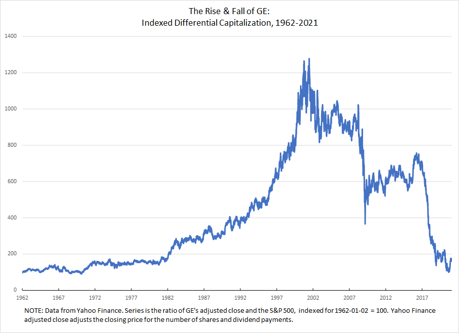
The above is the indexed ratio of GE’s adjusted closing price to the S&P 500. I downloaded both series from Yahoo Finance. You can select the date range to download as well as the frequency. Learning to do all that should take you less than an hour depending on your general web skills.
I opened both series in Excel. I had already downloaded the same date range, so I could directly compare the series as downloaded. But I first converted both to an index, using the first day of available data for GE as the base. This calculation just involves dividing each value by the base value. Common practice is to then multiple by 100.
Once you have both indexed series, you divide GE by the S&P 500. I again multiplied that by 100, so the value for the very first day is 100.
Performing all the steps in Excel could be very quick if you’re familiar with Excel or have good intuition with it. It could also be an exercise in extreme tedium. The indexing does not have to be performed day by day by day, thank the gods! The above has almost 15,000 data points. Calculating the indexed value point by point would have taken a very long time. Maybe worth it if my dissertation was on it, but thankfully I was able to perform the calculation is less than a second with Excel. If you are not familiar with Excel, you could do an on-line course and get the basics in a couple of weeks of less than an hour a day. If you have a friend that is very good with Excel, they could show you what you need in an hour.
The above graph is 90% the Excel default. Learning how to use Excel graphs can be equal parts hair-pulling frustration and fun. But you can probably get the basics in a few days.
Maybe this description of the process may have served to dissuade rather than persuade you. But if that is that case at least you know that the quantitative aspect of CasP is more than you can take on at the moment. I still think there is valuable qualitative work to be done using CasP, although it would be limited in terms of claims about changes in power as understood by the owners of capital.
The way I read a graph like the above is as a map to the changing relative power of GE as understood by “the market.” One thing that I think many critics of CasP misunderstand is that CasP is not claiming relative capitalization is an objective measure of objectively given power relations. Rather, capitalization is a measure of how the powerful understand and evaluate their own power. That means the above graph shows the rise and fall of GE’s power, relative to dominant capital, as interpreted by the powerful themselves. Through the 90s, they saw GE growing more powerful. Come the dot-com bust, GE slumps, but remains highly powerful. Then, with the GFC it plummets. It limps back upward for the next few years, but fails to achieve its previous heights. Then, beginning in 2016, it starts to tear itself apart. Now, it is a shadow of its former self.
Rarely can you one-to-one a given event and significant, sustained market movement, although I analyzed such an event in the case of the Deepwater Horizon with my paper in Valuation Studies. Instead, there are numerous events and processes occurring that are leading the vested interests to see GE’s relative power growing and falling. It might be a commanding CEO with lots of political connections getting favourable laws passed. It might be their luck at offering a particular product suited to a cultural moment and then properly exploiting that moment with sophisticated marketing. It might be a research breakthrough on a new drug for which they will have a multi-decade patent and there is little potential competition on the horizon.
Constructing convincing narratives about why power has waxed and waned for a given capitalized entity is extremely important and one reason why we need more people doing qualitative research into corporate power.
JN cautioned that quantitative research can be scary not just because of the techniques but because of the risk it poses to our expectations. You might have a narrative in your head about the power of the companies has shifted during the period of activism you’re analyzing. And you might have some sense of the causal relationship between the activism and the corporation’s power. However, if the movement is relatively small and the company is relatively large, then any effect will disappear into all the events that bear on a massive global corporation. That does not mean there is no power story to be told and no insights to be gleaned from CasP. But it does mean you might not get the image you’re imagining. That said, if the movement is large and/or relatively effective and the company is relatively small, you absolutely might see the effects of their activism. In a chapter I wrote with Jeffrey Monaghan, which has just be uploaded to the bnarchives, we looked at several activist campaigns, including SHAC: Stop Huntingdon Animal Cruelty, which was an anti-vivesection campaign. Our research showed how the criminalization of SHAC was absolutely read by the market as increasing the power of Huntingdon.
I strongly encourage you to dig around, see what you can find quantitatively. Maybe you won’t end up doing an analysis of differential capitalization. But you’ll definitely learn some things about the targets of the anti-fracking movements.
-
January 26, 2021 at 11:49 am #245230
I agree with DTC here that the basics of CasP research (differential capitalization) are quite simple. When I started to do this type of work, it was revelatory.
I also remember the panic I felt when I tried to fit too much quantitative work into my master’s thesis. I didn’t have the time to do it right, or interpret the results to my satisfaction. I ended up getting the thesis done. But my mental health suffered.
Now that I know what I’m doing, I can usually churn out quantitative analysis on a tight deadline. But that’s because I’ve got the learning curve out of the way. The last thing you want is to be dealing with both a tight deadline and a steep learning curve.
-
January 29, 2021 at 7:20 pm #245239
DTC. Thank you for you’re detailed advice on the basics of undertaking quantitative CasP research. They’re really useful and encouraging.
Thank you to you too Blair. You’re comments are very sensible, and I appreciate what you’re saying about not taking on too much at this late stage. That said, I’ve actually started doing some quantitative analysis already. I think I’ve found some interesting things. I’m not going to spend months on it, but I think I’ll do a bit more analysis.
The firm I’m looking at is relatively small, bet the house on UK shale gas and lost. I already knew that before I ran the numbers. However, now I’ve computed its differential performance (relative to two relevant benchmarks), its given me a much clearer picture of how dependent their accumulation strategy was on UK govt policy support. I’ll post the graph once I’ve finished labelling it with my initial analysis. Would be interested to hear your thoughts.
Cheers
-
February 1, 2021 at 9:54 am #245256
Adam,
That sounds great. When, and if, you are ready to share any of your visualizations and interpretations, please do. I’m interested to see what you have found.
“its given me a much clearer picture of how dependent their accumulation strategy was on UK govt policy support.”
This sounds very encouraging.
-
February 1, 2021 at 10:39 am #245257
I conquer. Very glad that you’re jumping in the quantitative water and interested to see what you find.
-
February 9, 2021 at 8:38 am #245288
Hi all,
I just wanted to run something by you. As mentioned previously, I’m interested in the differential (de)accumulation of a small cap Australian energy/mining services corporation (AJL).
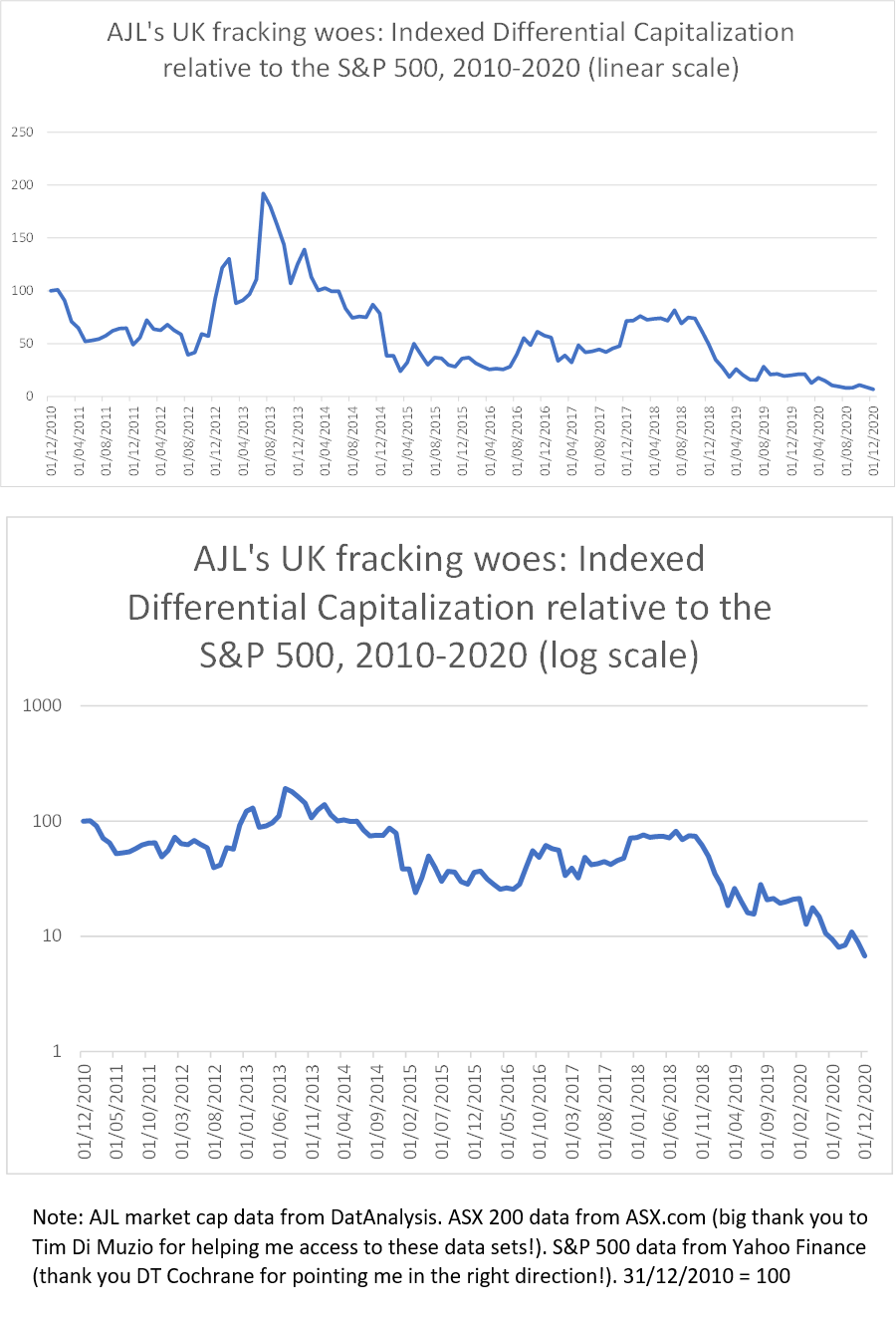
As indicated in the following two series, AJL (through their investment in shale gas exploration firm Cuadrilla in 2008) placed all their chips on a UK fracking revolution that never materialised. Both series are indexed to 31st December 2010 = 100 and end in December 2020. The top series measures AJL’s differential performance relative to dominant capital (the S&P500), while the bottom series measures their performance relative to the top 200 Australian firms (ASX 200)- a big thank you to Tim Di Muzio for helping me access the AJL/ASX data!
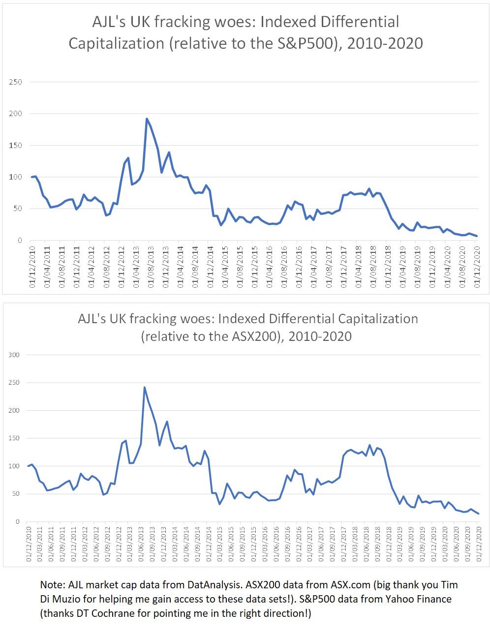
I won’t go into the granular details of their relative performance now, but it’s worth noting that the 2013 spike (and peak) corresponds to a period when there was a lot of hype surrounding the prospects for the UK shale gas industry; much of which was propogated and bolstered by the UK government’s discourse and policy support. At its 2013 peak, the market valued AJL at 411 million (AUD). This and other price spikes seem to correspond to UK government policy announcements/legislation that were supportive of fracking (e.g. when the government announced tax breaks for fracking companies in July 2013, AJL’s capitalization shot up by 81% relative to the S&P 500). Meanwhile, many of the falls correspond to setbacks for UK shale (e.g. AJL’s capitalisation – relative to nthe S&P 500 – plummeted by 40% after local government in Lancashire refused Cuadrilla planning permission for exploratory drilling). AJL has been on a downward spiral since September 2018 when their flagship exploratory fracking at Preston New Road, Lancashire precipitated a series of earthquakes, several of which were felt above ground. This led the UK government to pull its support for shale gas fracking and a moratorium has been in place ever since. AJL’s current market cap is 29 million (AUD).
At the moment, I am unsure as to which comparison makes more sense to use. With this in mind, I’d be interested to hear your thoughts on the following question:
Which benchmark do you think is most appropriate to use for a small-cap Australian firm such as AJL? The S&P 500 or the ASX 200?
If you look at the top series (the S&P 500 comparison), AJL beat the average once (for few months in 2013). However, in the bottom series (the ASX 200 comparison), AJL beats the average twice: in 2013 and for several months during 2017 and 2018. The latter spike corresponds to a period when Cuadrilla began drilling exploratory two wells in Lancashire after the UK government overruled local planners giving them the green light to proceed. As mentioned above, the 2017-2018 rally was cut short after the earthquakes and subsequant moratorium sent AJL’s shares tumbing. My instinct is to benchmark against the ASX 200 (or even the ASX energy index) rather than the S&P 500 as these are the ones that AJL investors would be more likely to use. All thoughts/suggestions are welcome.
Best wishes,
Adamp.s. As a side note. It is worth pointing out that dominant capital is not absent from this story. Although none of the oil/gas majors invested directly in UK shale gas, there is evidence that they were lobbying government to push ahead with the fracking agenda whilst biding their time to see whether it was worth making the plunge themselves. I suppose this is in line with the CasP argument that dominant capital prefers to expand through mergers and acquisitions (rather than greenfield investment):
https://powerbase.info/index.php/All-Party_Parliamentary_Group_on_Unconventional_Oil_and_Gas
https://www.theguardian.com/environment/2018/oct/26/energy-minister-had-private-meeting-with-fracking-firms-in-may-claire-perry
https://www.theguardian.com/business/2014/feb/04/bp-shale-gas-drillingThe majors did not buy into the US shale revolution until relatively late:
https://www.forbes.com/sites/christopherhelman/2018/07/27/bp-pays-10-5-billion-for-a-second-chance-at-the-u-s-shale-game/
https://www.reuters.com/article/us-usa-shale-majors-insight-idUSKCN1R10C3 -
February 9, 2021 at 9:40 am #245289
Looks very interesting! IMO the more you look at both figures, the more the difference between the two benchmarks is minimal. If I understand your interpretation, “beating” the average means the line going above 100. I think the better approach is to look at rising or falling differential capitalization. Your analysis of 2013 still stands and you avoid possible problems when the numerator is very small. For example, a small company could be rising in differential capitalization, but this rise could always be below 1 or 100. If the differential measure was re-indexed so a date equals 100, that is a good note to make in a footnote or below the graph.
- This reply was modified 5 years, 5 months ago by jmc.
-
February 9, 2021 at 6:15 pm #245299
Thanks JMC! That’s really helpful
-
February 9, 2021 at 10:02 am #245294
Fascinating results. I would personally use both series. As James says, the results for either denominators are more or less the same. That’s actually important to show.
Also something to think about. See what the data looks like using a log scale on the vertical axis. This will ‘zoom’ in on the recent collapse in differential capitalization. On a linear scale, a collapse in differential capitalization looks like a flat line at y = 0. But on a log scale, the line will head south forever.
Use the scale that best tells the story you want to highlight.
-
February 9, 2021 at 6:19 pm #245300
Cheers Blair! I’ll give that a try
-
-
February 9, 2021 at 7:19 pm #245301
Adam,
Regarding which indices to use, I think Blair’s advice is sound. Usually, more evidence makes your case more robust — although too much evidence can also clutter it.
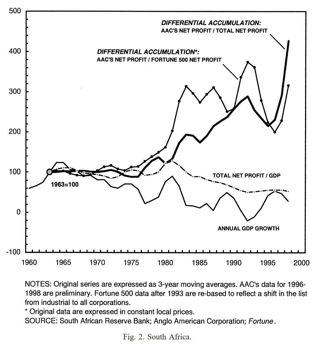
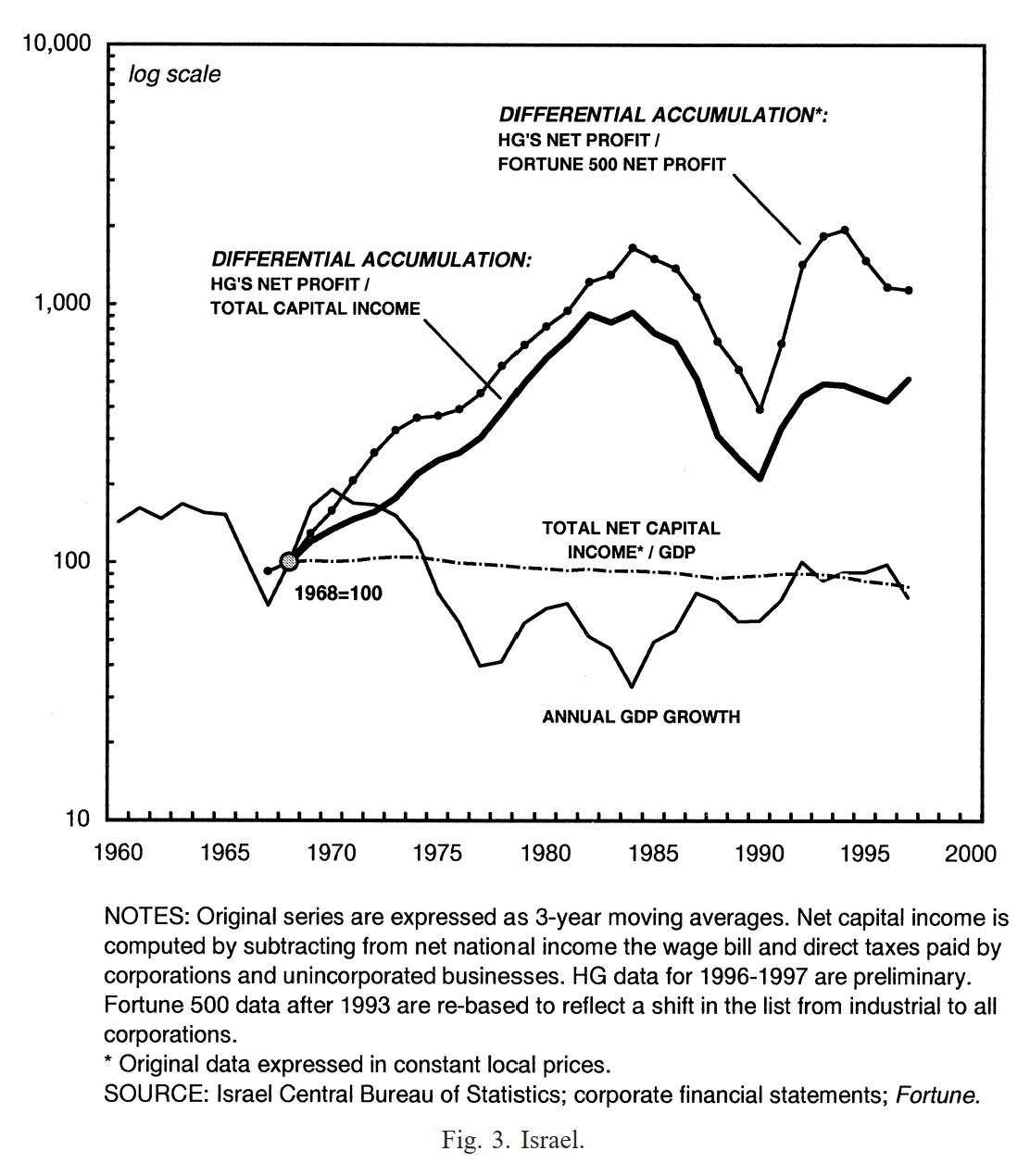
Below are a couple of graphs from a 2001 comparative article we wrote on the dominant capital groups in South Africa and Israel and the extent to which their differential accumulation impacted the end of Apartheid and the agreement with the Palestinians. In this article, we tried to look at both global and local measures, and we often did so in the same graph.
Going Global: Differential Accumulation and the Great U-turn in South Africa and Israel
- This reply was modified 5 years, 5 months ago by Jonathan Nitzan.
-
February 10, 2021 at 3:18 am #245303
Thanks Jonathan! That’s really useful.
I’m just wondering, what made you decide to use linear scale for the top graph and log scale for the bottom?
Cheers,
Adam-
February 10, 2021 at 7:40 am #245304
Adam,
In South Africa, growth was negative in the 1990s, and you cannot compute the log of non-positive numbers. Also, the numbers in South Africa were not growing exponentially as in Israel.
-
February 10, 2021 at 9:39 am #245305
Thanks Jonathan. That makes sense.
So, I followed Blair’s advice and recreated my AJL charts using log scale.
The top series (see below) is one of the original charts I posted the other day (AJL versus the S&P 500- linear scale). The second series is based on the same data, only this time charted using log scale on the vertical axis (as per Blair’s suggestion). I’m a bit of a novice with log charts, so I’d be interested to hear people’s thoughts on the differences between the two visualisations.
My instinct (in this case) would be to use the linear chart in my analysis as I think it’s easier to interpret (and tell AJL’s story with). But that could just be because I’m a log chart novice!
- This reply was modified 5 years, 5 months ago by Adam Marshall.
-
February 10, 2021 at 10:01 am #245307
Adam,
The advantage of a vertical log scale are: (1) the slope of the time series is proportionate to the series’ temporal rate of change, so you can see how fast the series changes regardless of its absolute magnitude; this is not the case with a linear presentation; (2) it is equally easy to see small and large changes, which is a nice feature when the series grows or decays exponentially; this is not the case with a linear plot.
When these features are unnecessary or counterproductive, then a linear scale is better.
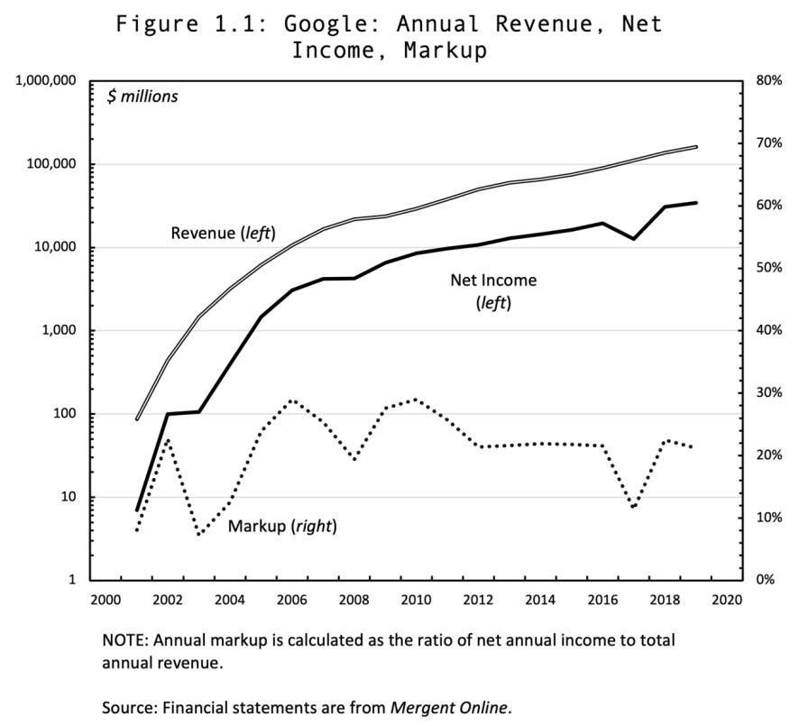
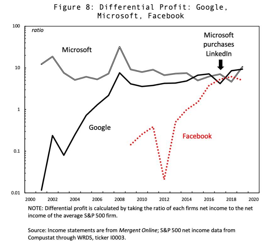
The following two charts, taken from Chris Moure’s 2021 Working Paper on Capital as Power, ‘Soft-wars‘, shows the usefulness of both log and linear scales.
The first figure shows the exponential growth of sales and profit on a log scale and the markup (ratio of profit to sale) on a linear scale.
The second chart compares the differential profit of three large firms that differ markedly in their levels and rates of change. A linear scale won’t be able to visually demonstrate these differences.
- This reply was modified 5 years, 5 months ago by Jonathan Nitzan.
-
February 10, 2021 at 6:26 pm #245331
Thanks Jonathan. That’s really helpful.
Regarding your point about using linear scale in situations where log would be ‘counterproductive’; can you think of any examples where this would be the case (i.e. where using log scale might be counterproductive)?
Cheers,
Adam
-
-
February 10, 2021 at 7:00 pm #245332
can you think of any examples where this would be the case (i.e. where using log scale might be counterproductive)?
The answer depends on what you wish to show.
For example, suppose you have an exponentially growing series and you wish to show its variations regardless of magnitude, a log scale will be the right choice.
But if you are interested not in the variation, but in the actual level of the series — for example, when you plot the growth rate of GDP — a log scale will give you a skewed picture: it will stretch the low growth rates and squeeze the high ones. In this case, a linear scale will be better.
-
February 11, 2021 at 8:03 am #245333
Adam, I think your charts provide a good illustration of log vs linear scales. On the linear scale, what stands out are the two bumps in differential capitalization — one in 2013 and one in 2018. The log scale, in contrast, emphasizes the long-term downward trend.
Something to note. You can emphasize this downward trend by changing the limits of your y axis. Right now, excel is using a scale from 1 to 1000. But the data never gets close to either of those extremes. Have a look at the min/max values of your data and then limit the scale appropriately. This will make the log-scale graph look better.
One last trick. When you’re using a log scale that varies over only a few orders of magnitude, showing only factors of 10 (on the axis) leaves a lot of blank space. I find factors of 1, 2, 5, 10 fill in the space nicely. See the chart below for an example.
-
February 11, 2021 at 9:31 am #245334
Thank you Jonathan and Blair! Your explanations/clarifications re the benefits of log scale versus linear scale have been really helpful (and much appreciated!).
And hats off to whoever came up with the idea for this forum! It’s such a fantastic initiative. I doubt my rash forays into CasP land would have ever got this far had it not been for this platform (and its helpful users).
Cheers,
Adam-
February 11, 2021 at 10:00 am #245335
And hats off to whoever came up with the idea for this forum! It’s such a fantastic initiative. I doubt my rash forays into CasP land would have ever got this far had it not been for this platform (and its helpful users). Cheers, Adam
The forum has been around in some form for almost a decade–and I also don’t know the history of its origins. But I wholeheartedly share your opinion of its usefulness. We welcome more questions of this sort, because the collective knowledge on this forum tends to hibernate and hide from view when posts are infrequent.
-
-
February 17, 2021 at 9:26 am #245365
I’m going to echo Blair about the usefulness of the linear scale for showing the extreme spikes. In relative (to itself) terms they were not large changes, which is why the log scale compressed them. But if I imagine myself watching these markets at the time, I wouldn’t be thinking, “Well, sure the price is spiking relative to the S&P 500, but relative to their current baseline, it isn’t that much of an increase.” But, as Blair pointed out, the log scale makes clearer how much they’ve continued to decline since 2019, while it looks a little flat in the linear scaled graph.
One tip on formatting, if you format the horizontal axis, you can change the “number.” This looks like it is using an automatic date formatting that’s a bit overly busy. You don’t really need the days. You can create your own date formatting. I found it pretty intuitive, but I’m also speaking from years of Excel experience and perhaps forgetting what it was like to first start formatting graphs.
-
February 24, 2021 at 11:39 am #245391
Thank you DTC. That’s really helpful!
One thing I’ve been meaning to ask: Does anyone know of any CasP research that combines quantitative analysis of differential accumulation with ethnographic methods?
Thanks,
Adam
-
March 2, 2021 at 12:31 pm #245398
None to my knowledge, but that was long my dream. I did extensive archival research for my dissertation and wished I could speak to both the corporate insiders and the traders.
I conjoined CasP to a actor-network-theory as an empirical, constructivist qualitative method. Obviously lots of development of ANT was through ethnographic work. I think they make an ideal pairing (although not everyone agrees!).
While standard fare macroeconomics tries to answer what is happening in the economy just from analysis of aggregates, my interpretation of CasP is that it offers a mapping of power that must then be explained, and that explanation requires nitty-gritty empirical work, of which ethnography would be a powerful tool for insight.
-
March 5, 2021 at 6:12 pm #245403
Thanks DTC. I’m a little surprised that nobody has tried marrying the two before. But then again, I suppose the CasP approach hasn’t been around that long. I definitley agree with you that ethnography has the potential to be a powerful tool for exploring the stories that lie behind the aggregates. Let’s wait and see!
-
-
-
October 21, 2021 at 6:09 am #247025
Hi all,
I just wanted to pick your brains about something. I’m looking for earnings data for the S&P 500 (going back 10-15 years or so). Although I have access to Rober Shiller’s data (www.econ.yale.edu/~shiller/data.htm), I’m a little confused as to what this data represents.
What’s confusing me is that I’ve seen Shiller’s referred to as pertaining to both the “S&P Composite” AND the “S&P 500”. However, according to the S&P website the S&P 500 and the S&P Composite (1500) are separate indexes- the former representing the 500 largest corporations, the latter “combining three leading indices, the S&P 500®, the S&P MidCap 400®, and the S&P SmallCap 600®, to cover approximately 90% of U.S. market capitalization.”
https://www.spglobal.com/spdji/en/indices/equity/sp-500/#overview
https://www.spglobal.com/spdji/en/indices/equity/sp-composite-1500/#overview
So, basically, what I’m asking is whether Shiller’s earnings data (at least that covering the period 2010-2020) represents the S&P 500 (or something else)?
Thanks in advance,
Adam-
October 21, 2021 at 6:48 am #247026
Please ignore my last question. I’ve found the answer now. Most of you will proabably know this already, but I found the following explanation very helpful:
“(N)ot to be confused with the S&P Composite 1500…(t)he
composite index is just that, a composition that splices the S&P 500, which started in March 1957, with historical data that included the companies in the S&P 90, founded in 1926, the S&P 233 weekly index dating from 1923, and earlier market data painstakingly gathered by Alfred Cowles. Cowles used family money to found the Cowles Foundation and was responsible for collecting comprehensive US stock data from 1871 to 1930. His magnum opus, the 2nd edition of his Common Stock Index was published in 1939 and is now available online in PDF format.The S&P Composite has been popularized by Yale Professor Robert Shiller, and an Excel copy of the data, updated monthly, is maintained at his Yale website.”
Cheers
-
-
October 27, 2021 at 6:54 am #247055
Hi all,
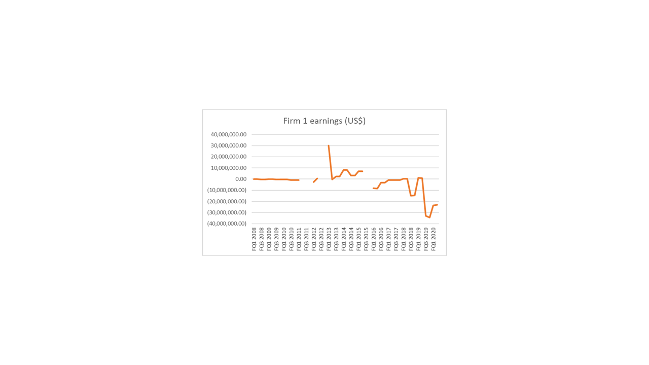
I just wanted to get your advice on something (yet again!). I’m in the process of calculating the differential (quarterly) earnings for several firms over a 13-year period (vs the S&P 500). However, some of the data sets I’m working with have several missing data points. For example, Firm 1 (see time series below) is missing data for Q2 2011, Q3 2011, Q4 2011, Q3 2012, Q4 2012, Q3 2015, and Q4 2015.
I gather that this issue can be dealt with using some form of interpolation. Looking at the time series below, I reckon (based on my rudimentary knowledge of interpolation!) that linear interpolation would be inappropriate in this case. That said, I am still a little unsure as to which form of interpolation would be the most defensible.
If anyone has any thoughts on this, I’d be really grateful for your input.
Cheers,
AdamAttachments:
You must be logged in to view attached files.-
October 27, 2021 at 7:01 am #247057
Apologies, I uploaded the time series as an attachment rather than an image. Here’s is is:
-
-
October 27, 2021 at 7:04 am #247058
Hi Adam,
Interpolation always involves guesswork. But as a rule, the simplest approach is probably best … unless you have a compelling reason for using more complicated interpolation. So yes, I’d use linear interpolation.
-
October 27, 2021 at 7:36 am #247059
Also, consider running your analysis with no interpolation, and see how your results compare to those with interpolation. If there is a big difference, then the interpolation needs a lot of justification.
-
October 27, 2021 at 9:05 am #247060
Thanks Blair! That’s very helpful
-
September 15, 2022 at 7:39 am #248337
Hi all,
Long time no speak. I hope you’re holding up okay.
Just wanted to get your thoughts on something. I’m currently writing a section in my thesis regarding the role of dominant capital in the UK fracking conflict. One interesting thing about this empirical case study is that there are relatively few large publicly traded corporations directly invested in the UK’s dash for gas.
Instead, much of this investment has come from privately held corporations. For example, private equity firms such as the Carlyle Group (who manage $376 billion worth of assets globally) and Riverstone Holdings ($41 billion) invested in Cuadrilla’s exploration activities in Lancashire.
The privately owned petrochemicals conglomerate Ineos is another key player (sales in 2017 of $60bn and EBITDA close to $7bn). Ineos are aiming to drill their own wells to secure gas supplies for their petrochemicals business.
Anyway, I’m in the process of arguing that, to varying degrees, these private firms can be categorised as dominant capital owing to their size and ability to (re)shape the terrain of social reproduction. However, I’m aware that most CasP scholarship tends to reserve this label for large publicly listed corporations (e.g. those comprising the S&P 500). I’d be interested to hear people’s thoughts on this.
Cheers,
Adam -
September 15, 2022 at 8:18 am #248338
Hi Adam,
I think the use of public firms to categorize dominant capital is mostly a matter of convenience. The capitalization of these firms is well known and captured by various databases. The capitalization of private firms is much harder to obtain, especially en masse.
-
September 15, 2022 at 10:14 am #248339
Thanks Blair. Yes, I suspected as much. For the purposes of my research, I’m not necessarily looking to chart the capitalization of these private firms. It’s more about acknowledging their size, the specific investments they’ve made in fracking, and identifying some of the strategies and tactics they’ve used to try and influence social processes in favour of their pro-fracking agenda. That said, I am planning to use the differential capitalization of AJ Lucas – a small-cap firm who put all their eggs in the UK fracking basket – as an (imperfect) proxy indicator for the on-going redistributions of power between the pro- and anti-fracking movements in the context of this conflict.
I would justify this in the following way: Because AJ Lucas is a small-cap firm that bet the house on fracking (through its investment in Cuadrilla Resources), its share price is extremely sensitive to the fortunes of UK shale gas. For example, at various times, its valuation has risen in response to pro-fracking legislation and policy announcements; and moved in the opposite direction when the sector received bad news – often due to the actions/pressure of anti-fracking campaigners. Most notably, when the government announced a fracking moratorium following a series of fracking-induced earthquakes at AJ Lucas/Cuadrilla’s exploration site in Lancashire. Given the above, plus the fact that the UK fracking lobby includes many more actors than AJ Lucas (several of which could be described as dominant capital), I think its justifiable to use AJ Lucas’ differential capitalization as an (imperfect) proxy indicator for the ongoing (re)distribution of power between the pro and anti fracking movments during the course of this conflict.
I’d be interested to hear people’s thoughts on these ideas 🙂
Cheers,
Adam
-
September 15, 2022 at 10:42 am #248340
I should add that, in addition to Nitzan and Bichler’s work, the above argument builds heavily on DT Cochrane (and also Jeff Monaghan’s) previous writings on CasP and activism. Especially:
- Cochrane, D.T., 2010. Review of Nitzan and Bichler’s” Capital as Power: A Study of Order and Creorder”. Theory in Action, 3(2, April), pp.110-116 https://bnarchives.yorku.ca/284/2/20100400_cochrane_review_of_casp.pdf
- Monaghan, J. and Cochrane, D.T., 2012. Fight to Win! Tools for Confronting Capital. In The Accumulation of Freedom: Writings on Anarchist Economics (pp. 95-116). AK Press https://bnarchives.yorku.ca/667/2/monaghan_cochrane_2012_fight_to_win.pdf
-
June 30, 2023 at 10:58 am #249659
Hi all. I just wanted to get your thoughts on something. The chart below contains the following four time series: AJ Lucas’ differential capitalisation relative to the S&P 500; IGas’ differential capitalisation relative to the S&P 500; support for fracking in the UK; and opposition to fracking in the UK. Each series covers the period December 2013-March 2020. AJ Lucas and IGas have been at the forefront of efforts to frack for shale gas in the UK over the last decade. During my fieldwork, I found that winning over public opinion was a key strategic aim for both the pro-fracking coalition and anti-fracking movement.
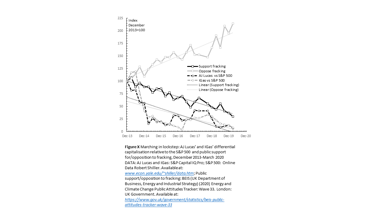
Having created this chart, I ran the following Pearson correlation tests:
AJ Lucas’ differential capitalisation vs IGas’ differential capitalisation (r=0.90). Strong positive correlation
AJ Lucas’ differential capitalisation vs public support for fracking (r=0.67). Strong positive correlation
AJ Lucas’ differential capitalisation vs public opposition to fracking (r=-0.74). Strong negative correlation
IGas’ differential capitalisation vs public support for fracking (r=0.66). Strong positive correlation
IGas’ differential capitalisation vs public opposition to fracking (r=-0.66). Strong negative correlation
Public support for fracking vs public opposition to fracking (r=-0.94). Strong negative correlation
Given the strategic importance of public opinion to both sides of the fracking conflict, intuitively, these results make a lot of sense, and I suspect they are not coincidential. For example, it is hardly surprising that rising opposition to fracking and the increased anti-fracking activism/direct action that came with it, are strongly correlated fracking companies’ differential decumulation. However, it is my understanding that to speak with any certainty about r values, they must be tested for significance. Therefore, having run these Pearson correlation tests (which I have very little experience with), I began looking into the most appropriate way of testing for significance. This led me down an internet stats advice rabbit hole, which has left me with more questions than answers. These questions include whether or not a Pearson correlation test is even appropriate in these circumstances? Or would a regression make more sense? Or a t-Test? As mentioned previously, I don’t have a background in quants so this sort of analysis is all very new to me. Any advice/tips regarding the above would be most welcome 🙂
Cheers,
Adam- This reply was modified 3 years ago by Adam Marshall.
- This reply was modified 3 years ago by Adam Marshall.
-
June 30, 2023 at 2:11 pm #249662
Interesting chart, Adam.
The negative correlation between falling differential capitalization of fracking firms and rising of anti-fracking sentiment raises the question of what exactly the public sentiment affects: differential earning, differential hype, or differential risk?
One way of answering this question, however tentatively, is to examine differential PE (fracking PE relative to S&P500 PE). This ratio removes the effect on differential capitalization of differential profit, leaving us with the ratio of differential hype to differential risk.
Granted, this is only a makeshift decomposition, since capitalization usually reflects future rather than preset profit; but still, it might be an interesting thing to examine.
- This reply was modified 3 years ago by Jonathan Nitzan.
-
June 30, 2023 at 5:36 pm #249664
Thanks Jonathan. That’s really helpful! Just to give you a clearer picture, I’ve already compared AJ Lucas’ differential earnings (EBIT) to its differential capitalisation (see chart below). As you can see, for most of the decade, the firms’ differential earnings were either negative or very small.
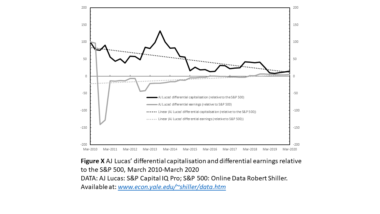
Read in light of my prior knolwedge of UK fracking and the hype that surrounded it (especially in the early 2010s), this chart suggests to me that the periodic spikes in differential accumulation were largely driven by hype. 2013 saw the largest spike in differential accumulation. During this period, the hype surrounding UK shale gas was arguably at its peak and public opposition had yet to become widespread. The other significant, albeit much smaller, spike in differential accumulation came in 2018 when AJ Lucas’ UK fracking firm (Cuadrilla) were, following lengthy planning battles, drilling its first exploratory well in the UK since 2013. As time progressed, and the companies struggled to progress their fracking plans due to planning delays, protests, and geological issues, this hype gave way to investor anxiety that their UK shale gas investments were at (differential) risk and the expected future (differential) earnings would never materialise. In November 2019, when the UK government announced a moratorium on fracking the differential risk associated with these investments increased significantly. The following headlines provide a flavour of this story:
‘AJ Lucas shares surge on UK shale speculation’ (Wen, 2013: Online).
‘AJ Lucas shares slump as green groups laud “stunning victory” on UK fracking’ (Macdonald-Smith, 2015: Online).
‘AJ Lucas shares surge as investors eye UK shale bounty’ (Macdonald-Smith, 2016: Online).
‘Fracking companies’ shares slide following UK government halt’ (Thomas, 2019: Online).
Regarding your helpful suggestion about measuring the differential PE. Unfortunatley, I do not have PE data for these firms and no longer have access to the relevant financial databases. Moreover, because my submission deadline is rapidly approaching, I do not really have the time to conduct any extra analysis. With this in mind, I’d be interested to get your thoughts on the differential earnings data/analysis presented above and whether (and to what extent) you think this data/analysis can substitute for the PE data you suggested I analyse?
Thanks again!
Adam
P.S. Over the weekend, I’m hoping to produce a similar chart to the one above for IGas (the other fracking firm I’m focusing on).
-
-
AuthorReplies
- You must be logged in to reply to this topic.