Home Forum Political Economy No way out

  • Creator
    Topic
  • #245815

    From Real World Economics Review Blog by Shimshon Bichler & Jonathan Nitzan

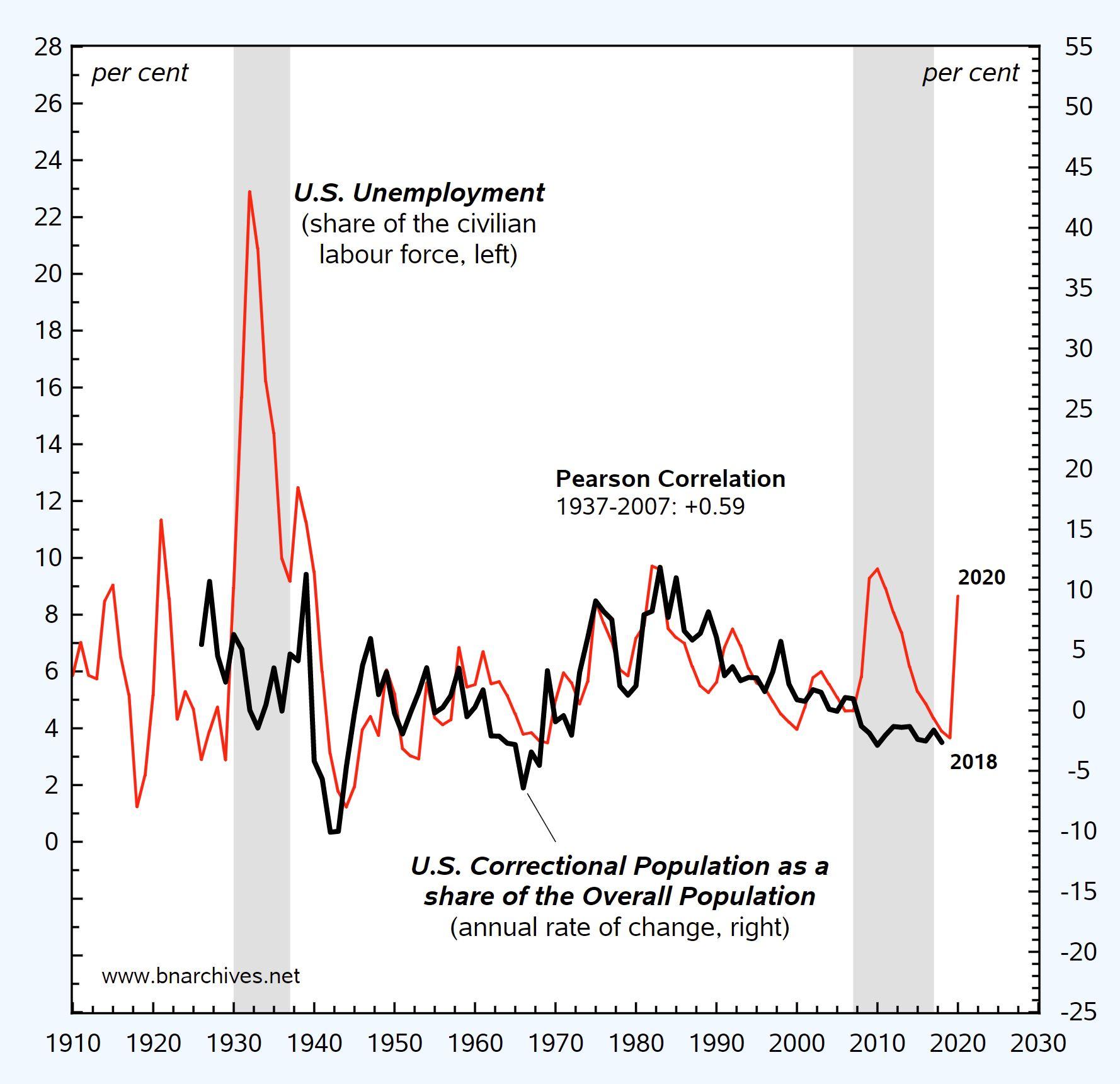
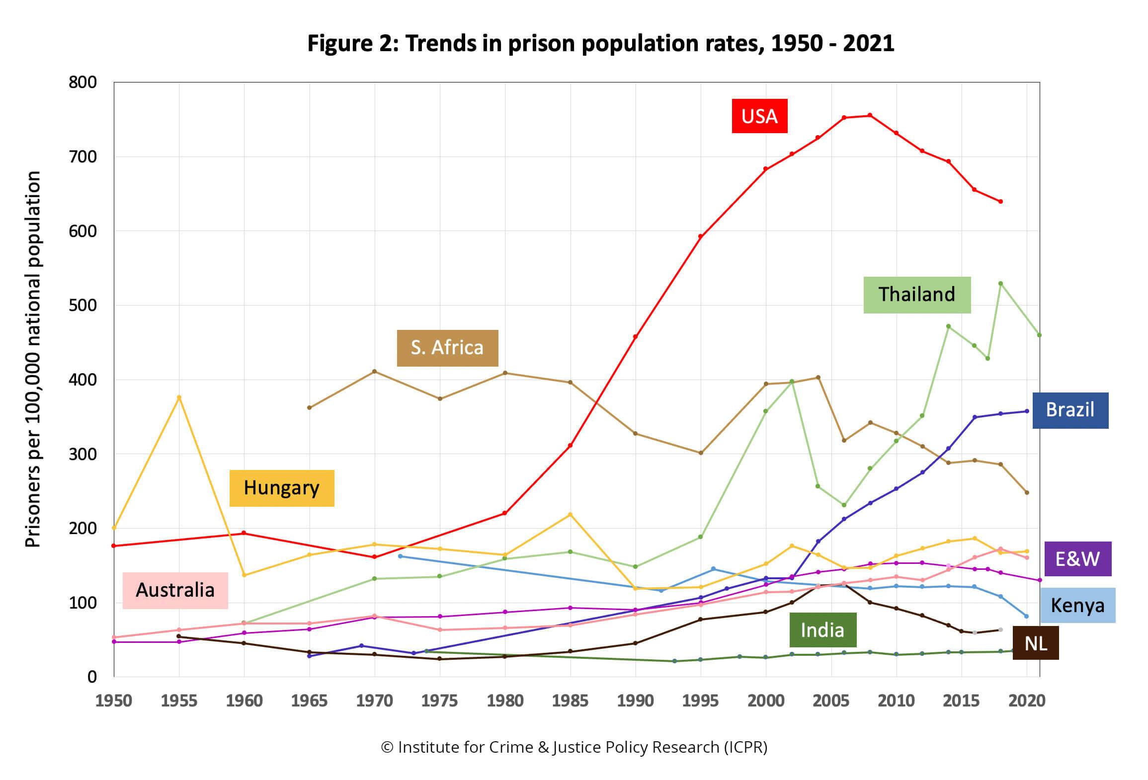
    For much of the 20th and early 21st centuries, U.S. unemployment and incarceration went hand in hand. This is how the rulers disciplined their subjects. But during the Great Depression and Great Recession, the link broke, if only temporarily. The following figure shows these patterns.

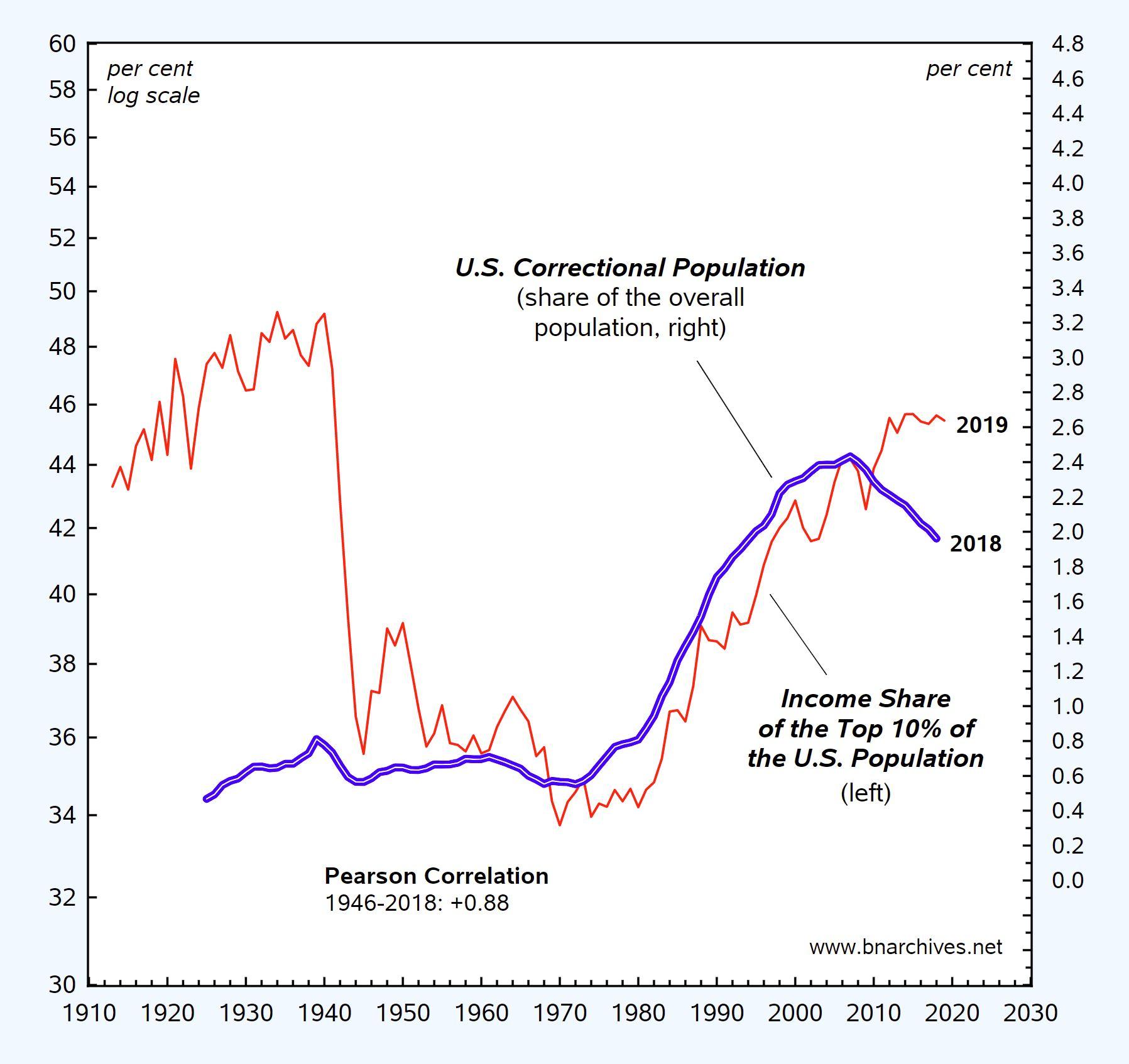
    Part of the rational for this two-pronged discipline is illustrated in the next figure: since the Second World War, the income share of the top 10% of the U.S. population has been tightly correlated with the country’s correctional population, although this correlation seems to have broken recently.

    For more, see our 2014 paper ‘No Way Out’.

Viewing 3 reply threads
  • Author
    Replies
    • #245817
      jmc

        In a previous post, I used prison population data to demonstrate the benefits of web-scraping.

        Jonathan, your post inspired me to run my script again. The update did not add much data, but is the rising global trend a portend of BN’s argument about the redistribution of income share?

        In the figure above we have the data binned across the x-axis. For each bin, the dot is the mean and the error bar is the confidence interval. For those interested, here is a log-normal plot of data without binning. On the log scale the upwards trend looks flatter, but I would have to leave it to an expert or interested researcher to speak to the significance of increasing the prison population by even a few percent (which would require a massive coordination of lots of states agencies).

        Data is from https://www.prisonstudies.org and the dataset has 215 countries.

        • This reply was modified 2 years, 9 months ago by jmc.
      • #245820

        Interesting, James and Jonathan. James, something else you might try is running regressions on the trend within each country and see how the slopes are distributed.

      • #245821
        jmc

          Done! Interesting that it appears normally distributed (have not analyzed skew).

          For fun, I plotted the results on a world map. Colors are discrete quantiles. The United States, as always, is similar to some brutal regimes.

          • This reply was modified 2 years, 9 months ago by jmc. Reason: Put in a better version of the world map
          • This reply was modified 2 years, 9 months ago by jmc.
        • #245829

          Damn, James! You’re becoming a serious quant! Interesting to see the Middle East as a rising carceral state. And judging by your histogram, it looks like that the average trend is upward.

          • #245831
            jmc

              Thanks, Blair!

        Viewing 3 reply threads
        • You must be logged in to reply to this topic.