Home Forum Political Economy Praising stock market milestones

  • Creator
    Topic
  • #4547
    jmc

      November 24, 2020: In a bizarre 90-second press conference about the rise of the Dow Jones Industrial, Trump notes that the index passed a “sacred” number: 30,000.

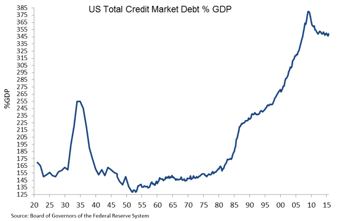
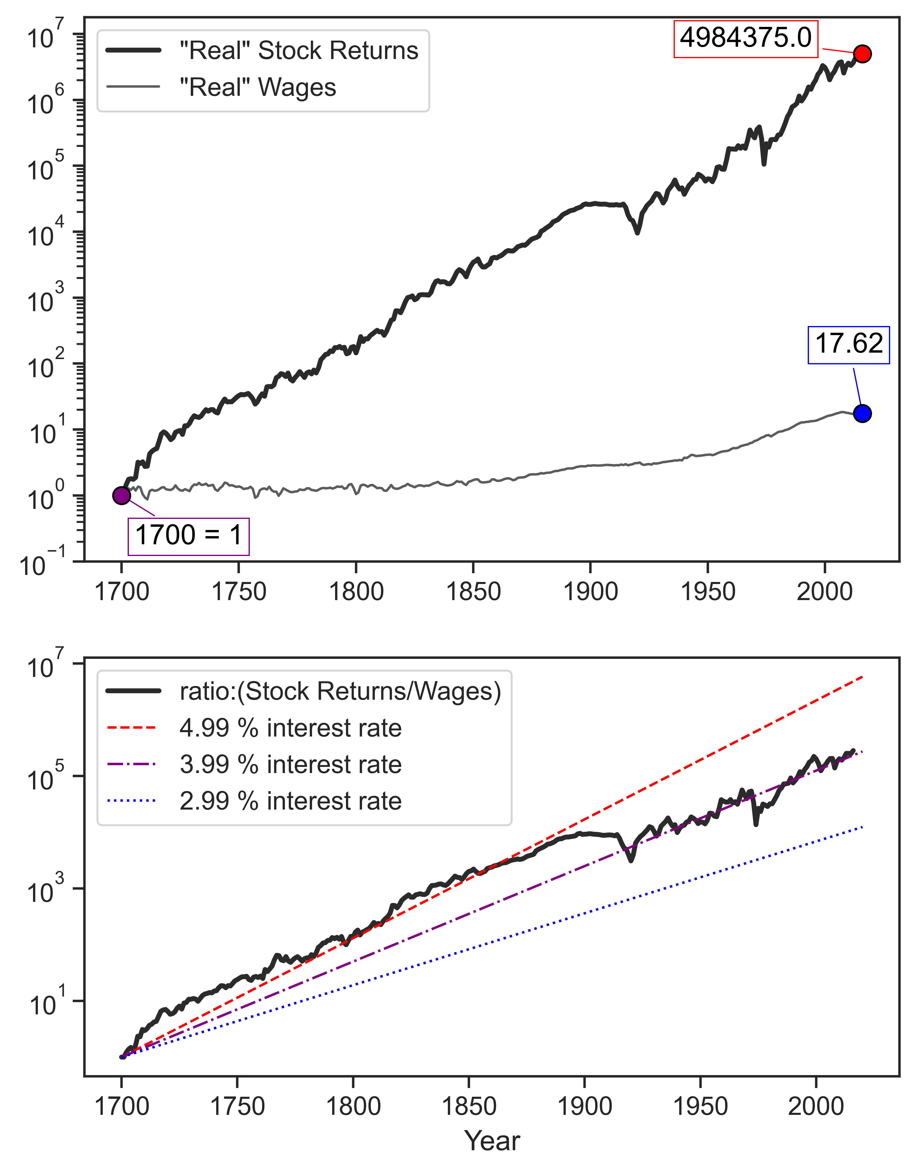
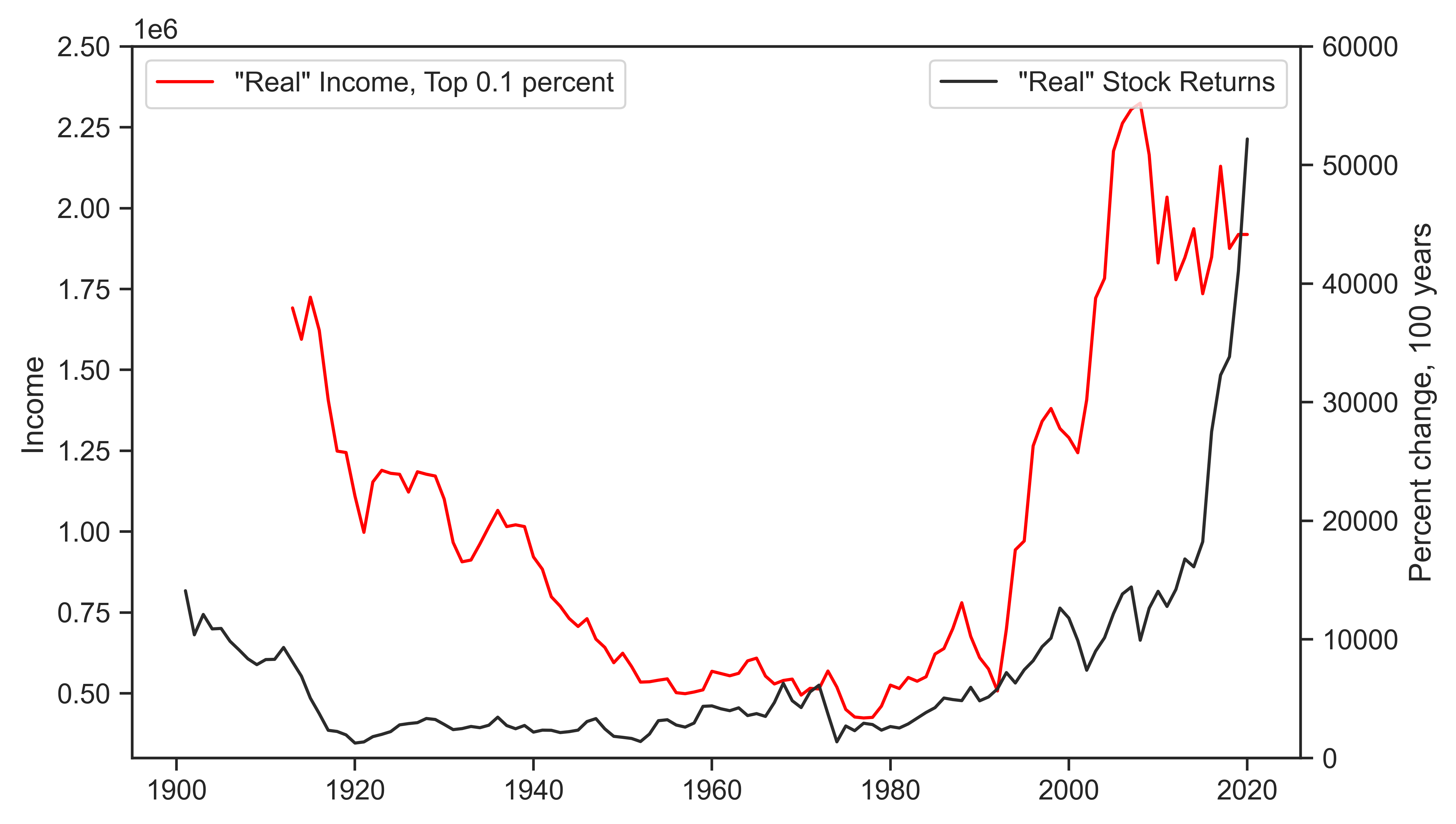
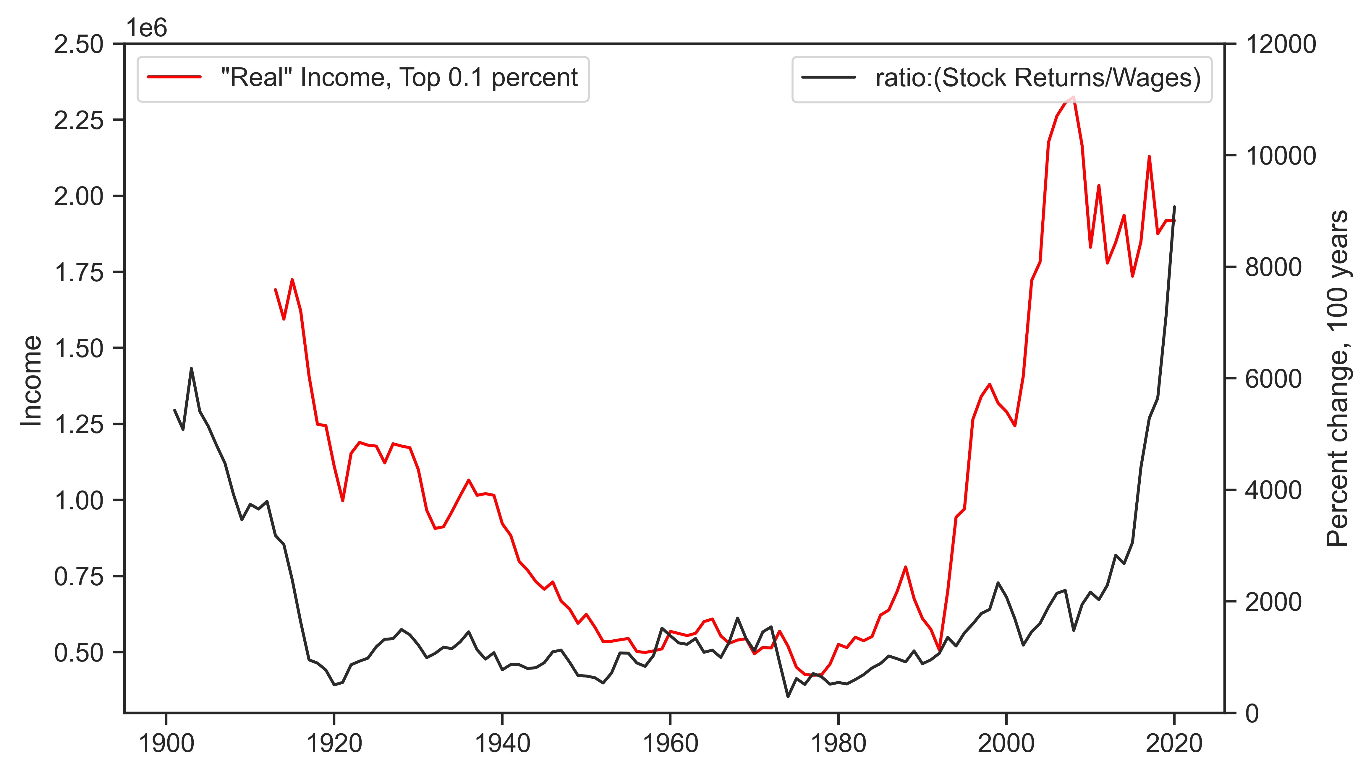
      Like so much of the Trump presidency, we can talk about Trump’s vainglory. As much as it would be fun to let loose in that type of conversation–especially because his ego is a bruised apple at this point–I think that we can transform Trump’s praise of stock market milestones into broader questions related to political economy. I can think of a few, but I am sure there are more:

      A) What does an elected politician think the stock market represents to their audience? Do they believe the everyday citizen will (mis)understand what stock market gains mean? Is Trump speaking directly to the Buffet’s and Bezos’ of the world, essentially saying he has been good for dominant capital?

      B) Are there other memorable examples of politicians theatrically praising stock market rises? Outside of the United States? Is this more of an American custom because of indices like the Dow Jones and the S&P 500?

      C) Should we be critical of how retorts to Trump’s praises of the stock market–e.g. stock markets rose more during Obama’s presidency–will often accept a naive meaning of a stock market index. Does this type of response fall into the trap of using the stock market as a barometer of social benefits and overall wealth?

    Viewing 6 reply threads
    • Author
      Replies
      • #4548

        Over the past 140 years, the total return on U.S. equities (capital appreciation plus reinvested dividends) grew 1,009 times faster than the manufacturing wage rate. Since the 1980s, the increase was due entirely to the rising stock market. Hourly wages, measured in ‘constant’ dollars, moved sideways.

        In the United States, celebrating the stock market is celebrating the victory of the capitalist mode of power. The underlying population — made mostly of wage earners, small business people and those who are unemployed or not in the labour force — rarely if ever contests this celebration. This silence suggests something about the future of this society.

      • #4550
        jmc

          Jonathan, I agree with the CasP interpretation of what the stock market represents. I think the motivation behind my post was to think about the reasons for a politician to openly celebrate a stock market increase. There are ideological dimensions–some held by the politician and some held by the public.

          From the politician side: Is an elected politician–Trump or otherwise–transparently celebrating the capitalist mode of power? Or are some mistakenly assuming that a stock market increase is a good barometer of economic well-being? Does it matter what they believe?

          From the public side: Does the figure you present have argumentative force on its own? Or is it likely that without a deeper re-think of what capital is, the public will misunderstand or skew the meaning of the figure you present? If I had to guess, the general audience can dislike Trump talking about the stock market, but they are also not re-conceptualizing why someone would refer to stock market gains.

          • #4551

            Good questions, James.

            Our figure simply suggests that the vast majority of the population — i.e., those depending on labour income, small business income and state handouts — have gained little, and since the early 1980s, nothing, from the stock market’s glory. The stock market tide doesn’t lift all boats. It lifts only a tiny fraction of them. So while the business of America is business, most of its population is not in that business.

            But then, probability notwithstanding, roughly half the U.S. population are made to believe that they are going to be rich; i.e., that some day they will ride the upper series instead of the lower one. That hope makes them admire those who are already rich. And that admiration makes them susceptible to stock market glorification.

            I don’t know if that suffices as an explanation, but it flows.


        • #245103
          jmc

            Using GFD and Bank of England data shows a very similar situation in Great Britain:

            • This reply was modified 3 years, 3 months ago by jmc.
            • #245105

              Neat, James!

              Would be nice to see both charts combined + detailed footnotes on sources since the series are surely spliced many times over.

              • #245106
                jmc

                  Agree 100%. I will be able to get that done later in the week (labels + notes).

            • #245108

              Devil’s advocate: The total return to the S&P 500 is a theoretical construct in the sense that no individual actually earns this indexed value. To do so, they’d have to own exactly the stock that the S&P was composed of. With modern ETFs, that’s easy. A century ago, it was not.

              More problematic, though, is that few capitalists perpetually reinvest their dividends. And as people die, their fortunes tend to be disperse among many decedents.

              My point is that this comparison of stock market total returns to wages paints a picture of runaway income inequality — something that hasn’t actually happened. Many people earn close to the average wage (over time). But few people (if anyone) earns the actual S&P total return.

              Thoughts?

            • #245109

              Here is a comparison between the ‘real’ total return on the S&P 500 index (market value + reinvested dividends deflated by the U.S. CPI) and the ‘real’ net wealth of the top 0.01% of persons in the U.S. (also deflated by the CPI).

              We can see that the two indices go pretty much together from 1980 onward, but that prior to 1980 their movement was cyclically similar by very different in trend.

              I doubt that the reason for these variations is that, prior to 1980, the top 0.01 of persons did not reinvest their dividends in something.

              A more likely reason, I think, has to do with the way in which the portfolio the top 0.01% has been reallocated over the years. For example, if a relatively small portion of this portfolio was in equities till 1980, and if that portion rose dramatically since 1980, we would expect the correlation between the two series to increase, as it has.

              Of course, these are just guesses. The answer requires a much closer look a the data.

              • #245111
                MaS

                  Nice chart. Here is my simplistic guess at what has happened since the 80s.

                  They became correlated because they both became driven by the same underlying ‘credit/leverage driven accumulation mechanism’ which took over in the 80s. The growth of credit – simply put, Wall Street was unleashed and found ‘innovative’ ways of creating new claims on things (for which there was great demand). And accommodative policy – the Fed (knowingly or unknowingly) did their best to make sure these claims were ‘made whole’, through ensuring access to liquidity. The losses are ‘deferred’, but it more seems like they are actually transferred – as they manifest in increasing inequality. The 0.01% are those who are able to accumulate the most claims while times are good, and make sure those claims are made whole.


                  As for OPs original question. This quote comes to mind:

                  “I guess the trouble was that we didn’t have any self-admitted proletarians. Everyone was a temporarily embarrassed capitalist.’ – America & Americans, 1966

                  Commonly quoted as:

                  “Socialism never took root in America because the poor see themselves not as an exploited proletariat, but as temporarily embarrassed millionaires.”

              • #245112

                Nice chart. Here is my simplistic guess at what has happened since the 80s.

                The causes you cite may affect the ‘real’ total return on the S&P 500. But how do they impact the correlation between the ‘real’ total return on the S&P 500 and the ‘real’ net assets of the top 0.01%?

                The latter magnitude is determined by the portfolio of the top 0.01% and by the different ‘real’ returns on the various assets in that portfolio. As this portfolio changes, so will the correlation with the ‘real’ total return on the S&P 500. No?

              • #245158
                jmc

                  Apologies for the delay in my update. Below is a single image of the two plots above:

                  Sources: Global Financial Data, code _TFTASD for UK FTSE All-Share Return Index (w/GFD extension), 1694-2020. UK Composite Average Weekly Earnings series is from A47. Wages and Prices 1209-2016, A millennium of macroeconomic data for the UK, The Bank of England’s collection of historical macroeconomic and financial statistics. UK CPI is taken from A millennium of macroeconomic data for the UK.

                  I thought about Blair’s comment on runaway inequality. In this figure capital’s growth relative to labor is exponential and I think there is a simple reason why. The figure does not show what any real capitalist has earned because it spans hundreds of years. It is more of a symbolic representation of two types of life under capitalism. Say we have two families that in 1700 are at the same starting point. The “capital” family has bought into stock market and holds stock worth the return of 1. The “labour” family works for a living and also starts at 1. The huge growth of the “capital” family is a representation of someone buying stock in 1700 and holding up until the present.

                  The difference between continuous exponential growth of stock returns and the U-shape of historical income inequality might have something to do with generational change. Fortunes from 1700 do not straightforwardly carry over into the present. So much can happen: inheritance tax, lost fortunes, individuals enter and leave the market through buying and selling.

                  The following figures try to find the U-shape in the generational changes of stock returns and the stock/labor ratio. For comparison they are plotted against the .999 percent income of GBR, retrieved from WID.

                  • This reply was modified 3 years, 3 months ago by jmc.
              Viewing 6 reply threads
              • You must be logged in to reply to this topic.