Groping in the Dark: The Untold Side of Research
October 2, 2019
Originally published on Economics from the Top Down
Blair Fix
There is an exciting side of blogging that I want to explore here. Blogging can tell the story behind research. This is something you don’t get in journals.
Most scientific articles obey a formula that goes like this:
- Here is the question I asked.
- Here is how I answered the question.
- Here is what I found.
This formula makes the article easy to read, since we know what to expect. But it gives the reader a misleading sense of how science is done. It makes science seem like a set of procedures — a production function. Scientists ask a question, investigate it, and publish the results. Easy peasy.
But this is not how science works. In the finished paper, the clean formula hides the (many) missteps along the way. It hides the confusion that dominates scientists’ lives. The real process of doing science is more like “groping in the dark”. Here are Bichler and Nitzan describing the quest for knowledge:
cientists grope in the dark. They search for cues, hints and leads. They often stumble, falling flat on their faces. Rarely do they know exactly what they are looking for. But they go on. And then, suddenly, comes a revelation.
That moment of revelation is what drives us as scientists. It’s the rush of clarity after long periods of confusion. To paraphrase Karl Marx, revelation is the ‘opiate of the scientist’.
What’s interesting is that the moment of revelation is not really about answering our questions. No, the revelation is usually about determining the right question to ask . Here’s Charles Darwin commenting on his breakthrough in explaining evolution:
Looking back, I think it was more difficult to see what the problems were than to solve them.
Here is Albert Einstein expressing the same sentiment:
The formulation of a problem is often more essential than its solution, which may be merely a matter of mathematical or experimental skill. To raise new questions, new possibilities, to regard old questions from a new angle, requires creative imagination and marks real advance in science.
Although my research pales in comparison to Darwin’s or Einstein’s, my experience mirrors their own. I have found that asking the right question is the hardest part of science. There is no formula for how to do it. It’s a creative process that remains a mystery to most of us. We’re just glad when we stumble on the right question.
With this in mind, I’d like to tell the story of how I stumbled on the relation between energy use and institution size. The finished research is here . Like most scientists, I wrote the paper to make it look like I knew what I was doing all along. But I assure you that I did not. Behind the published results was a sea of confusion.
The growth of large corporations is related to energy use
In the last blog post, I discussed the evidence that first got me interested in hierarchy. For some reason, the employment share of large corporations increases with energy use per capita.
For a long time, I was stuck on this correlation. My focus was technical. I wanted to get more data that related corporate concentration to energy use. At the time, this was a daunting task because it challenged my analytic abilities.
I began my research career as a committed Excel user. But the funny thing about Excel is that it tends to blow up when you give it a few million lines of data! So answering the questions that I was asking involved abandoning Excel. I learned to use R , which is a programming language that specializes in statistics and data analysis. I’ll write more about my journey with R in future posts. As you’ll see, I’m a bit of an R evangelist.
Back to my research, I was focused on how corporate concentration relates to energy use. I looked at US data and found a pretty tight relation. As energy use increases, the employment share of the top 200 corporations does the same:
 United States (Source)
I then went back to the international data. Using my new skills in R, I looked at trends both between and within countries. Here is the result. The figure below shows the employment share of the top 25 corporations (in each country) plotted against energy use per capita. Each squiggly line shows the path through time of a specific country. As energy use increases, the employment share of large firms increases as well.
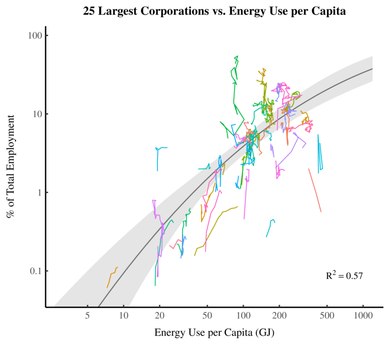 Trends Between and Within Countries (Source)
For the longest time, I was stuck on this relation. By ‘stuck’, I mean that I was thinking this: “These are interesting results! Now what do I do with them?”
The breakthrough didn’t come with new data. It came with a new question. One day something dawned on me. The people who moved to large firms had to come from somewhere! Where were they coming from ? Small firms? Medium-sized firms?
As soon as this question was posed, it was obvious that I was missing another side of the story. What happened to small firms as energy use increased? After this question was posed, it was simple to answer. We look at rates of self employment. People who are self employed belong to a firm of size 1 — pretty much the smallest you can get. So when we study self-employment rates, we are looking at the employment share of very small firms.
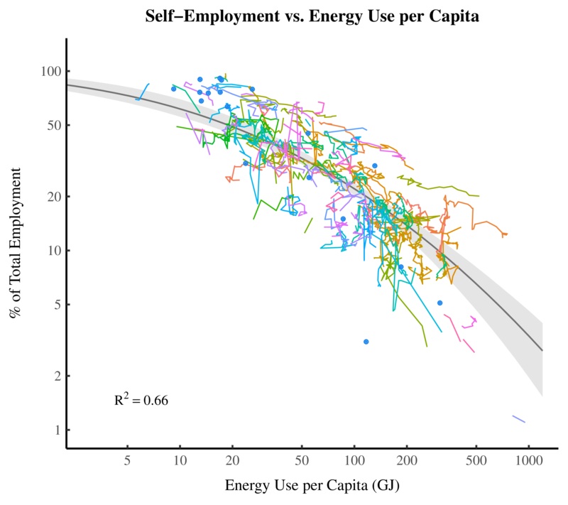
So what happens to self-employment rates as energy use increases? It turns out that they plummet. Here is a century of US data. To show the correlation with energy, I’ve plotted self employment on a reverse scale. So going ‘up’ on the graph corresponds to a decline in the self-employment rate. As US energy use increases, self employment rates decline in lock step.
 United States (Source)
The same is true when we look at international data. Self employment rates plummet as energy use increases. Here’s the trend between countries. Each squiggly line is the path through time of a single country.
 Trends Between and Within Countries (Source)
This discovery was moment of revelation for me — a dose of the scientific opiate that I crave. But it soon led to more confusion.
Something doesn’t add up here
Let’s review the results so far. As energy use increases, the employment share of large firms increases. So large firms are getting larger. At the same time, the self employment rate declines. So there are fewer and fewer small firms. This evidence all points to one conclusion: as energy use increases, firms tend to get bigger (on average).
This conclusion was ‘in the data’. But for a long time I didn’t want to see it. In fact, I thought this conclusion was wrong. Why? Because it contradicted results from Jonathan Nitzan and Shimshon Bichler. Looking at the US, Nitzan and Bichler found that the average size of US corporations decreased over the 20th century. Here is their figure from page 336 of Capital as Power:
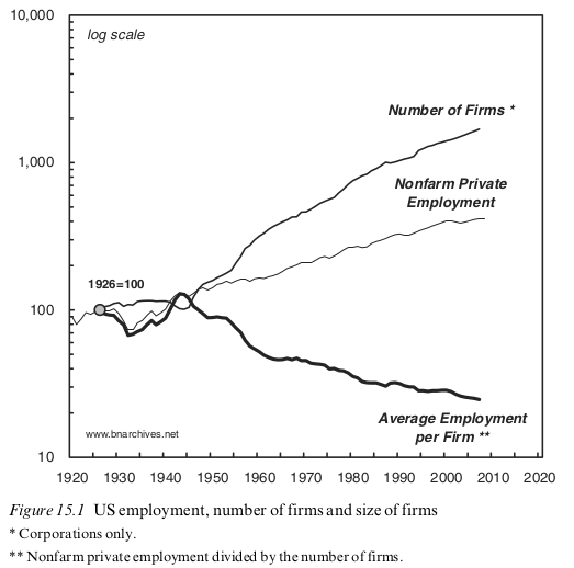
Something doesn’t add up. My results suggested that firm size should have increased over the 20th century. But Nitzan and Bichler clearly found the opposite trend. So what gives? Were Nitzan and Bichler wrong? I didn’t think so — their analysis was impeccable. Was I wrong? More likely, but I could not find a problem in my methods.
Again, the resolution to this confusion came by clarifying the question. You see, Nitzan and Bichler were asking a different question than I was. They were asking — how has the average size of corporations changed with time. But I was asking — how has the average size of all businesses changed with time. There is a subtle difference.
A corporation is a particular legal form for a business. But it is not the only form. Many small businesses are unincorporated. This was especially true a century ago when incorporation was a new concept.
Over the 20th century, incorporation became increasingly popular. So we have two contrasting trends. On the one hand, rates of self employment declined. On the other hand, an increasing proportion of self employed people chose to incorporate their activity. As a result, if you look at average corporation size, you see a decline. More and more self-employed people incorporated, and this dragged down the average size of the corporation. This explains Nitzan and Bichler’s results. But if you look at the average size of all businesses, we should see an increase. Self employment rates declined and large firms got larger. So the average size of all businesses must be increasing. That would explain the results that were in my data.
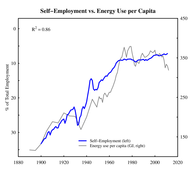
Having clarified the question I was asking, finding the answer was simple. I looked at the average size of all businesses, both incorporated and unincorporated. I found that the average size of US firms increased over the 20th century. And it did so in lock step with energy use per capita:
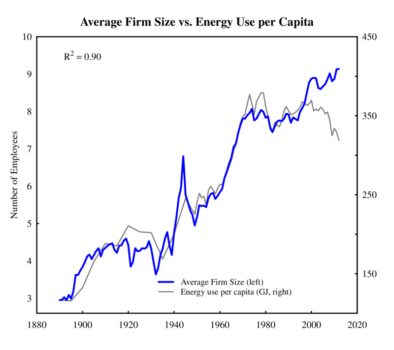 United States (Source)
The same is true between countries. Here is a plot of international data. Each dot is a country, with vertical bars showing uncertainty in the data. As energy use per capita increases, so does average firm size.
 Trends Between and Within Countries (Source)
What about those other institutions?
The relation between firm size and energy use was intriguing. It was so intriguing that I actually forgot that other institutions existed. You know those little things called governments? They’re kind of important. Again, revelation came when I realized I wasn’t asking an important question: is government size related to energy use?
Well, it turns out that it is. As energy use increases, governments tend to get larger. Here is US data over the last century.
 United States (Source)
Look at how the employment share of US government grows until the 1970s. Then it tanks as the 1970s energy crisis takes hold. If you lived through this era (I did not) you likely remember how government policies changed. Politicians went from preaching exuberant spending to calling for restraint and cutbacks. What you probably didn’t realize is that there was something deeper going on. The way we behave and the policies we favor are somehow connected to how we consume energy. We’re only beginning to understand how this works. </p.
Again, the US is not alone here. Across all countries, government size tends to grow with energy use. The squiggly lines in the figure below represent the path through time of different countries.
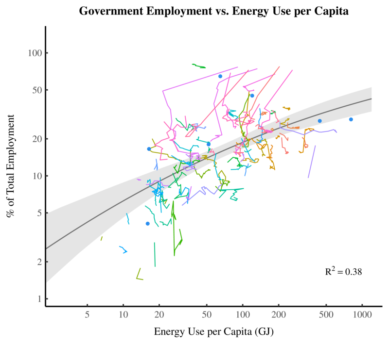 Trends Between and Within Countries (Source)
What’s interesting is that not all countries are moving up and to the right on this figure. Some are moving down and to the left. This means their energy use is declining, as is the government share of employment. The most conspicuous example of this trend is the collapse of the Soviet Union. After the collapse, energy use and government size dramatically declined in former Soviet states. I’ll talk more about this in a future post.
This isn’t the end of the research story, but it’s enough for one post. I hope you’ve enjoyed this journey into the underside of research. I’m sure other scientists who are ‘groping in the dark’ can relate to my confusion. And for non-scientists, I hope it makes you appreciate how science works. The messy process of doing science is very different from how it appears in scientific journals.